WORK
(SCHOOL WORK)WSS
(概要)OUTLINE
一人でも多くWeb業界への就職者を増やす。
(ja)
5人チームでWSS(ウェブスタディサッポロ)のリニューアルサイトを制作しました。メンバーごとに役割を分担し、自身はデザインとコーディングの両方を担当。デザインは主にトップページを、コーディングはトップページと下層のコース紹介ページを手がけました。初めてのグループワークであり、クライアントとの打ち合わせを重ねながらの制作だったため、実務に近い経験ができたことが非常に貴重でした。チームで協力して一つのものを作り上げる達成感と、現場に必要なコミュニケーション力の大切さを実感しました。
(en)
We created a redesigned website for WSS (Web Study Sapporo) as a five-member team. Each member was assigned specific roles, and I was in charge of both design and coding. I mainly designed the top page and handled the coding for both the top page and the subpage introducing the courses. As it was my first experience working in a group and involved multiple meetings with the client, it provided me with a valuable opportunity to experience a workflow similar to real-world projects. I was able to truly feel the sense of accomplishment in creating something as a team, as well as the importance of communication skills required in a professional setting.
(詳細)DETAILS
(jp)
- ターゲット
- 20~30代の未経験の男女(主に女性)。
- 課題
- サイトの設計改善をしたい。非常に複雑な設計になっていて、ユーザーが迷いやすい。数年前に作ったサイトのため古く、ビジュアルも少ない。
- 目的
- ユーザーが迷わないようなサイト設計にする。内容を一新し、トレンドを取り入れたデザインにする。説明会への参加者数、サイトからの応募者数を増やす。
- コンセプト
- 新しい私を広げる場所。
- 情報設計
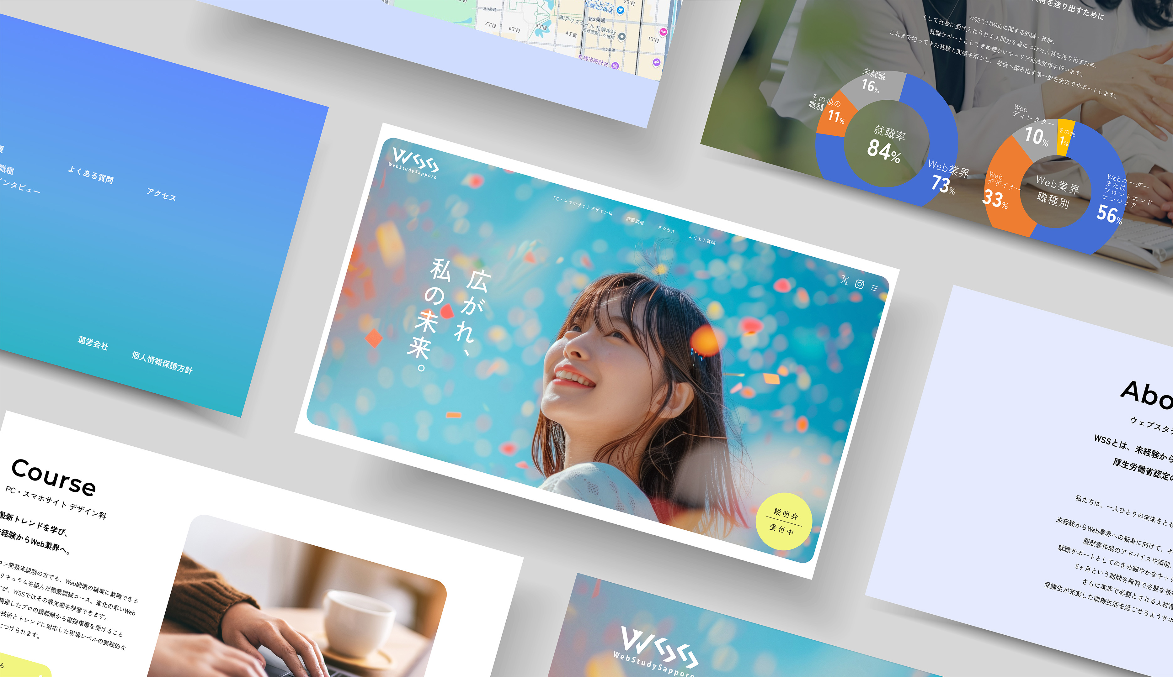
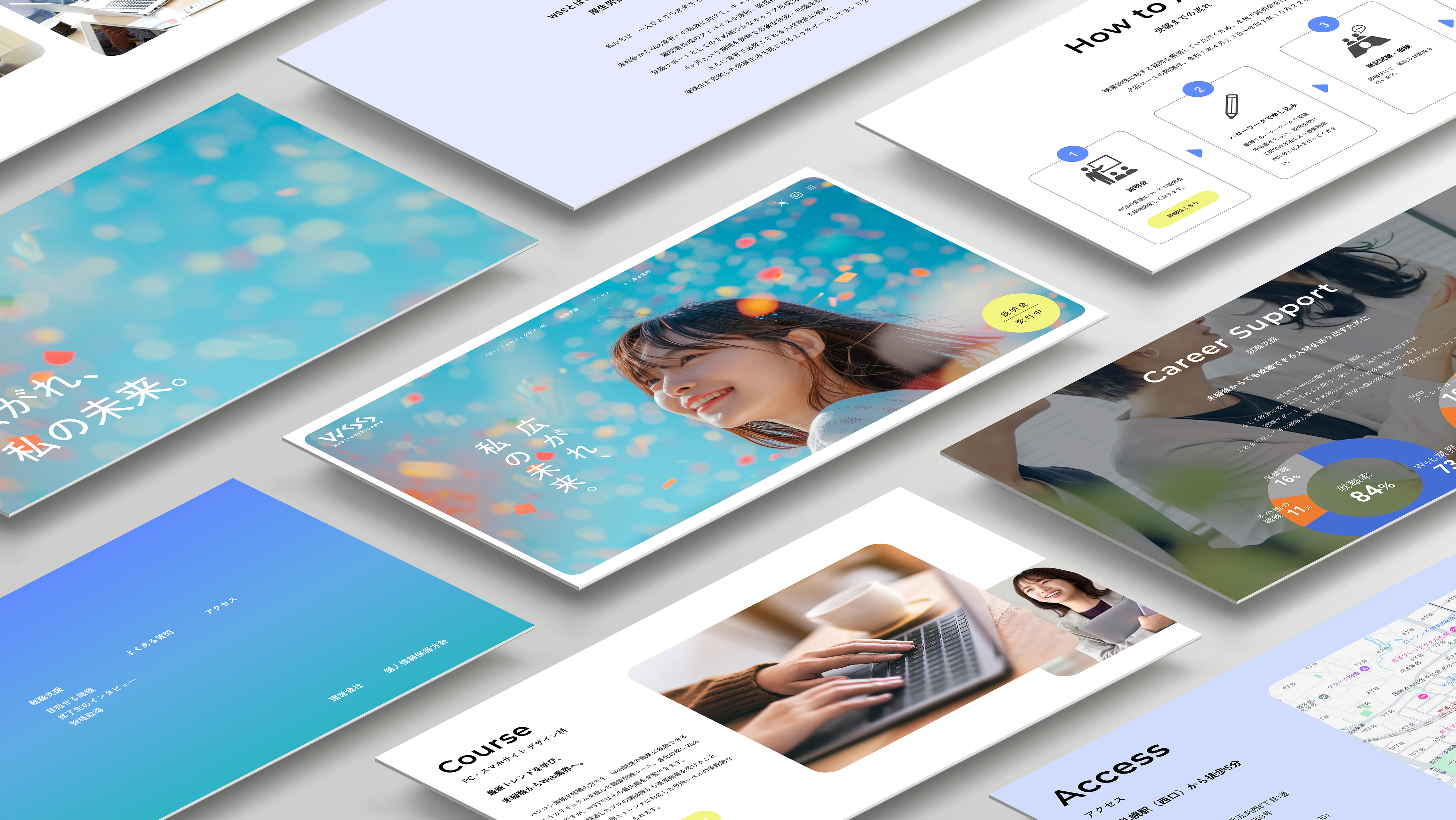
- サイトからの応募者数を増やすという目的を達成するため、ユーザーが迷わず説明会に申し込める導線設計を重視しました。説明会への申し込みボタンを常に画面右下に表示されるように配置し、どのページからでもスムーズにアクセスできるようにしています。また、アクセントカラーであるイエローを使用することで視認性を高め、自然と視線が向かうようにしています。また、これまでのサイトでは明示されていなかった申し込みの流れをトップページに新たに追加し、ハローワークを通じた手続きや筆記試験・面接の有無といった必要な情報をあらかじめ伝えることで、受講希望者にとってわかりやすく、また安心して行動に移せるよう工夫しました。
- デザイン
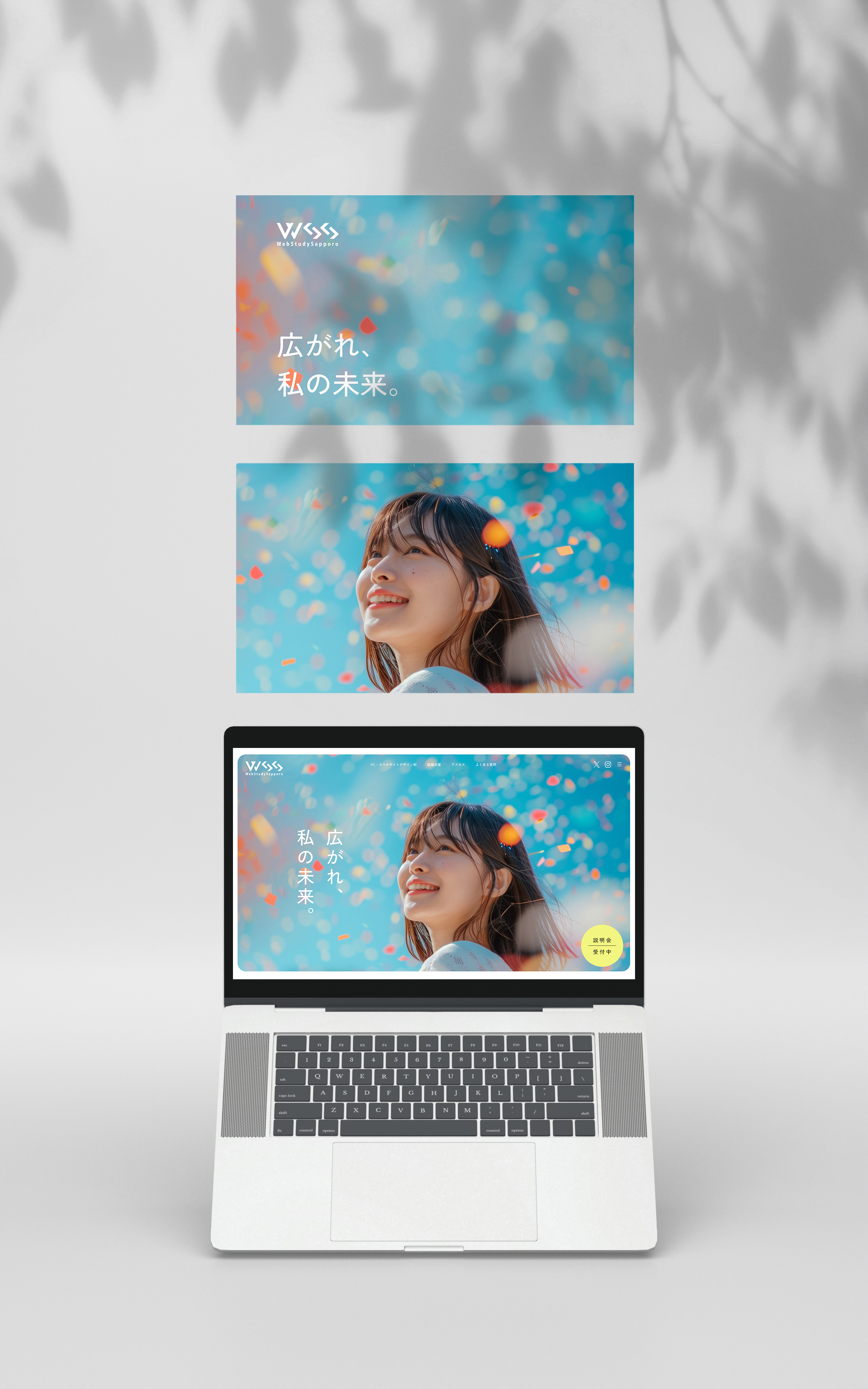
- 現行サイトの印象を一新するために、配色から見直しを行いました。配色は3色に決め、ブルーとライトブルーで学校としての信頼感を表現し、イエローで未来への明るさや前向きな気持ち、新しい一歩を踏みだすエネルギーを表現しました。コンセプトである「新しい私を広げる場所」とキャッチコピー「広がれ、私の未来。」に合わせ、メインビジュアルには上を見上げて微笑む女性の写真を採用。前向きな気持ちや未来への期待感を視覚的に伝えることで、訪れたユーザーが未来への一歩を踏み出せるような、前向きな気持ちを引き出すデザインを意識しました。
- 意識したポイント
-
① ユーザー視点での情報設計
コンセプトを設定するにあたり、グループでターゲットとなるユーザーのストーリーを描き、受講希望者の立場に立って設計を進めました。職業訓練校に関心を持つユーザーは未経験者がほとんどで、「新しいことにチャレンジしたいけど、未経験でも本当に挑戦していいのか不安」といった思いを抱えていると想定しました。そこで、サイトを訪れた方が「自分にもできそう」と前向きな気持ちになれる構成を心がけることで、目的である説明会と学校への応募者数増加につながると考えました。また、ユーザーが自身の受講をリアルに想像できるよう、現行サイトにはなかった卒業生の声や就職実績、一日のスケジュールを新たに掲載。情報はグラフなどを用いて視覚的にわかりやすく伝えることで、不安のハードルを下げ、通学中のワクワク感を感じ、実際に自分が通っているイメージをもっていただけるよう工夫しました。② 説明会申し込みフォームの導入
現行サイトでは説明会の申し込みが電話のみだったため、ユーザーにとって参加へのハードルが高いと感じられる部分がありました。今回のリニューアルではサイト上に申し込みフォームを新設し、ユーザーがいつでも簡単に参加申し込みができるようにすることで、利便性を高めました。申し込みまでの流れがよりスムーズになることで、説明会への応募者数の増加が期待できます。 - 制作期間
-
企画 / 情報設計 / WF4日デザイン1週間コーディング5日
- レスポンシブ対応
- なし (1920x1080で制作)
- 使用ツール
- Figma, Photoshop, VScode
(en)
- Target
- Men and women in their 20s to 30s with no prior experience (mainly women).
- Challenges
- The previous site had a complex structure that confused users. Its outdated layout and limited visuals made it difficult to navigate.
- Objectives
- Design a user-friendly structure that prevents users from getting lost. Completely renewal the site content and update the visuals with modern design trends. Increase the number of seminar participants and applicants via the website.
- Concept
- A place to expand the new me.
- Information Architecture
- To increase the number of applicants from the website, we focused on creating a clear user flow that allows visitors to easily sign up for information sessions. A floating “Apply for Info Session” button is always visible at the bottom right corner of the screen, providing users with quick access from any page. We used yellow as the accent color to ensure high visibility and naturally draw the eye toward the call to action. Additionally, we added a new section on the top page to clearly explain the application process—something the previous website lacked. This includes details such as applying through Hello Work (job placement office), whether a written test or interview is required, and other important steps. By presenting this information upfront, we aimed to make the process more understandable and help applicants to take action.
- Design
- To refresh the impression of the existing site, we started by redesigning the color scheme. We chose three main colors: blue and light blue to convey a sense of trust and professionalism as an educational institution, and yellow to express positivity, brightness, and the energy to take a new step forward. In line with the concept, “A place to expand the future me”, and the catchphrase “Where my future begins to grow”, we used a main visual featuring a woman looking upward with a gentle smile. This visual direction helps evoke a sense of optimism and forward-looking mindset, encouraging users to take their first step toward a new future.
- Key Points
-
1. User-Centered Information Architecture
To define the concept, our team created detailed persona and user story. We focused on users who are considering vocational training—most of whom have no prior experience in the field—and assumed they may feel uncertain about whether they’re ready to take on a new challenge. With that in mind, we structured the site to help users feel, “Maybe I can do this too.” We believed that creating a hopeful and relatable experience would directly contribute to our goal: increasing applications to both the info session and the program. To help users visualize themselves in the program, we added several new elements that were missing in the previous site: graduate testimonials, employment outcomes, and a sample daily schedule. These were presented using graphs and visuals to make the information easy to grasp and reduce hesitation, while also helping visitors imagine what life at the school would feel like.2. Online Application Form for Info Sessions
The original website only allowed users to sign up for info sessions by phone, which created an unnecessary barrier. In the redesign, we introduced an online application form directly on the site, enabling users to register anytime with ease. This streamlined process is expected to significantly increase the number of participants attending the sessions. - Prouction Time
-
Planning / Information Architecture / Wireframes4 daysDesign1 weekCoading5 days
- Responsive Design
- Not implemented (designed for 1920×1080 screen resolution)
- Tools Used
- Figma, Photoshop, VS code