WORK
(ORIGINAL WORK)SORI
-
Client
ORIGINAL WORK
-
Date
2025.04
-
Role
direction, design
-
Tools
Figma, Photoshop
(概要)OUTLINE
自分らしく、清潔に。自信をくれるヘアケアを届ける。
(ja)
架空のメンズヘアケア会社の公式サイトを制作しました。クリーンな印象を与えつつ他とは少し違うような、トレンディでスタイリッシュな印象を与えられるようにしました。
(en)
I created a fictional website for a men's hair care brand. The design gives a clean impression while also feeling a bit different from others — aiming to be both trendy and stylish.
(詳細)DETAILS
(jp)
- ターゲット
- 20代男性。
清潔感がほしいが、ヘアセットをキメすぎたくない人。
毎日使いやすい、ラフさを求めている人。
トレンドに関心がある人。 - 課題
- 競合が多いヘアプロダクト市場の中で、どうブランドの個性を出すか。
- 目的
- ブランドコンセプトに共感したユーザーの購入意欲を高め、スムーズにオンラインショップへ誘導し、 売上の向上につなげること。
- コンセプト
- きめすぎない、がちょうどいい。
- 情報設計
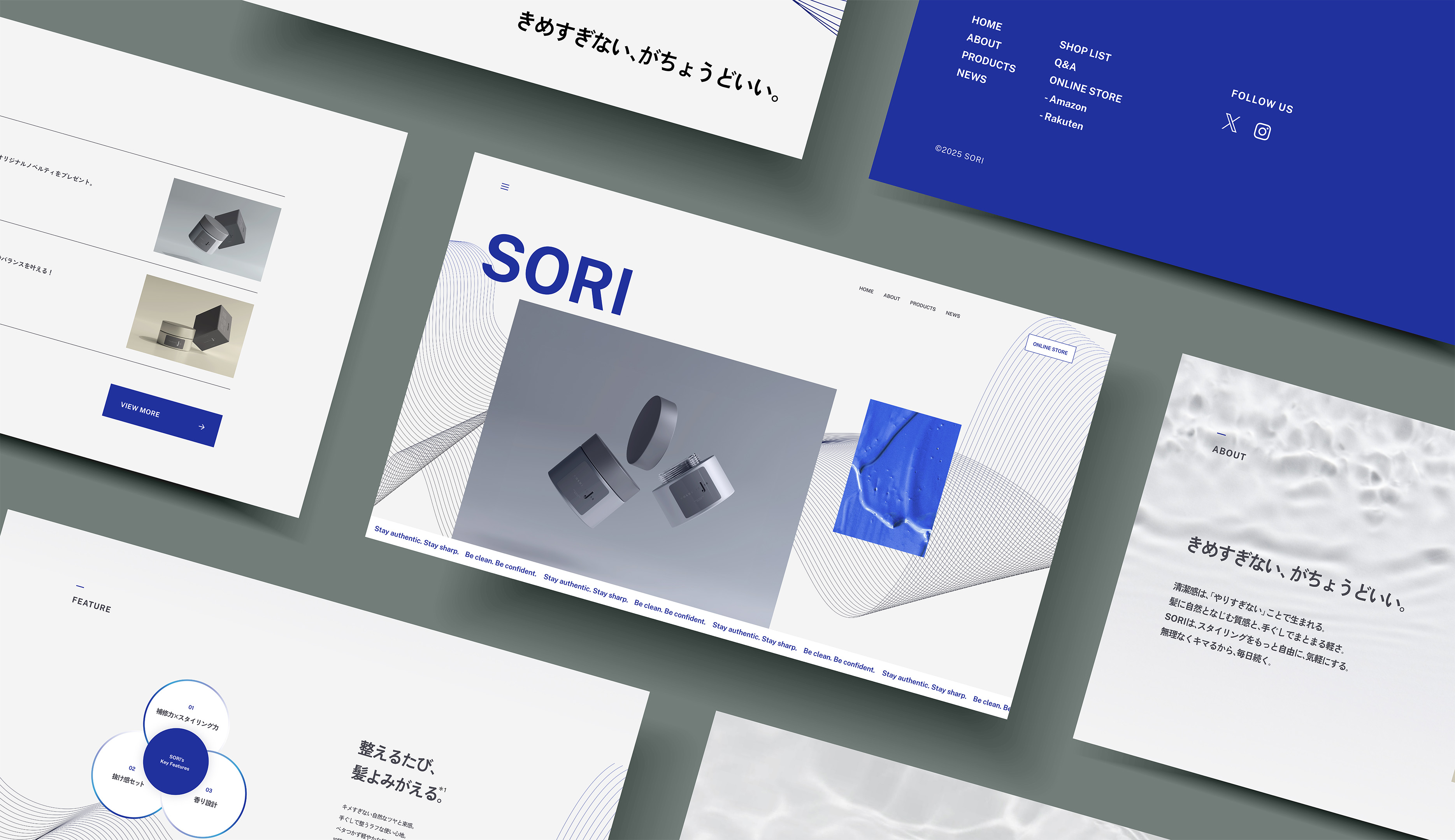
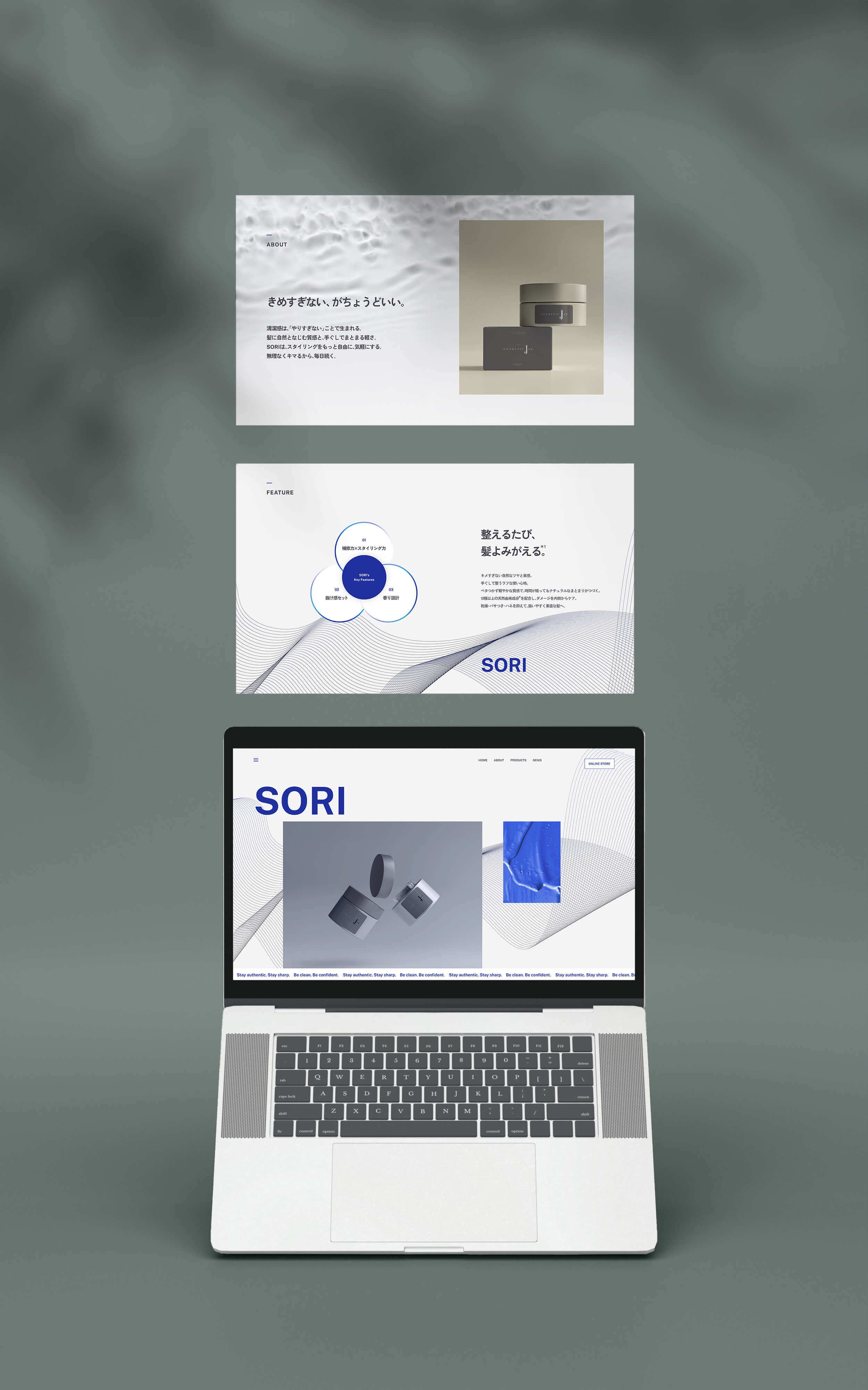
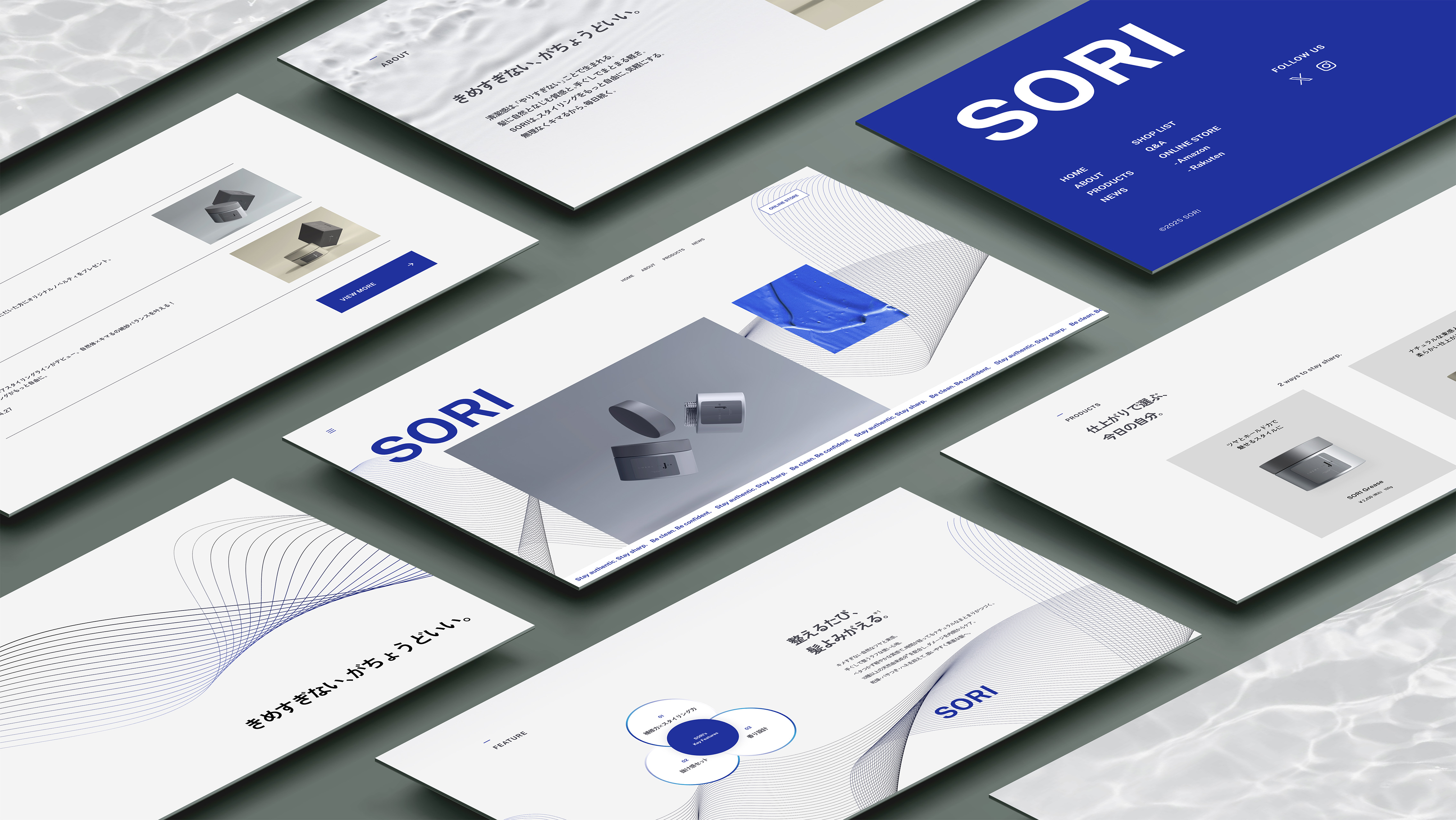
- ユーザーが迷わずオンラインショップへアクセスできるよう、ヘッダーとフッターの両方に「ONLINE STORE」ボタンを配置し、常に購入導線が視界に入るように設計しました。また、キャッチコピー「きめすぎない、がちょうどいい。」や「Be clean. Be confident. Stay authentic.」などのフレーズを、視認性の高い位置に配置することで、ブランドの世界観と商品の特徴を一貫して伝え、ユーザーをより引き込めるよう工夫しました。 FEATUREセクションでは、製品の主な魅力を3つの図と短い説明で整理し、視覚的にも理解しやすい構成にすることで、ユーザーが短時間で価値を把握し、商品選択へスムーズに進めるよう配慮しました。
- デザイン
- デザインコンセプトとして「クール」「今風な」「すっきりとした」「シャープな」「モダンな」という5つのキーワードをもとに全体設計をしました。ブランドコンセプトとして清潔感がキーワードの一つだったため、配色はホワイトとややネイビー寄りのブルーを基調とし、爽やかさの中に落ち着きとクールさを両立させました。また、背景や余白、補足要素にはグレーを使用し、全体に大人っぽく洗練された印象を与えるようにしました。PRODUCTSセクションでは2つの商品を並列に配置し、仕上がりの違いを視覚的に対比させることで、ユーザーが自分に合った商品を直感的に選びやすくなるよう工夫しています。
- 意識したポイント
-
① 模写
今回特に力を入れたのは「模写」です。17サイトの模写をし、ファーストビューからフッターまで様々な表現を組み合わせ、自分のデザインに反映させました。あしらい一つとっても丁寧に比較・検証し、最もユーザーにとってわかりやすく、かつクライアントの目的を最大限に達成できるデザインになるよう取捨選択をしました。以下はFigmaによる模写の過程の一部です。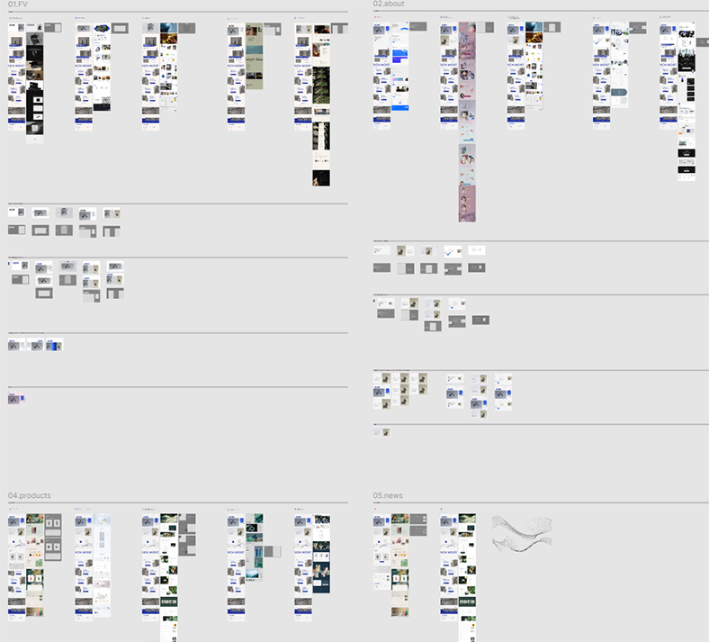
 ② 線の幾何学模様
全体の印象を「すっきり」「シャープ」に保つため、過度な装飾は避けつつも、無機質な印象にならないように工夫しました。そこで選んだのが、情報を邪魔せずに雰囲気を加える幾何学的な線です。ブランドの持つ「今風」「モダン」「清潔感」といったイメージとも親和性が高く、サイト全体のトーン&マナーをほどよく支えています。また、これらの線は視線誘導やセクションの区切りにもなり、メリハリがつくことでユーザーが自然に次の情報へと進みやすくなるようにしています。 - 制作期間
-
企画 / 情報設計 / WF2日デザイン1週間
- レスポンシブ対応
- なし (1920x1080で制作)
- 使用ツール
- Figma, Photoshop
(en)
- Target
- Men in their 20s who care about cleanliness but don’t want an over-styled look. They’re looking for easy-to-use, everyday products with a casual, effortless vibe. They are also interested in trends.
- Challenges
- How to express brand’s individuality in a sea of competitors.
- Objectives
- To increase sales by encouraging users who resonate to the brand concept, guiding them smoothly to the online store.
- Concept
- Effortless. But still sharp.
- Information Architecture
- To help users access the online store without confusion, I placed the ONLINE STORE button in both the header and footer, ensuring that the purchase path is always within view. Key phrases such as “Effortless. But still sharp.” and “Be clean. Be confident. Stay authentic." are placed in high-visibility areas to consistently convey the brand message and product appeal, drawing users further into the site. In the FEATURE section, I presented the three main product strengths using simple icons and short descriptions. This visually clear layout helps users quickly understand the value of the product and move smoothly toward a product selection.
- Design
- The overall design is based on five keywords: cool, trendy, clean, sharp, and modern. Since cleanliness is one of the core brand concepts, I chose a color palette centered around white and a navy-leaning blue, balancing freshness with a calm and cool tone. Gray is used for backgrounds, spacing, and supplementary elements to create a sophisticated, mature impression. In the PRODUCTS section, two items are displayed side by side to clearly show the differences, making it easier for users to intuitively choose the product that suits them best.
- Key Points
-
1. Practice Through Replication
One of the key focuses of this project was design replication. I studied and recreated 17 different websites, carefully analyzing everything from the first view to the footer. I extracted and combined various design techniques, incorporating them into my own work. Even for small decorative elements, I carefully compared and analyzed different approaches to determine what would be most intuitive for users while effectively fulfilling the client's goals. The image on the left shows part of the replication process in Figma.2. Geometric Line Patterns
To maintain a clean and sharp visual impression, I introduced geometric line patterns as subtle accents. These lines enhance the overall atmosphere without interfering with the content. They align well with the brand image—modern, trendy, and fresh—and help reinforce the tone and manner of the website. Additionally, the lines also serve as visual guides and section dividers, creating a natural flow that helps users navigate the site easily. - Production Time
-
Planning / Information Architecture / Wireframes2 daysDesign2 weeks
- Responsive Design
- Not implemented (designed for 1920×1080 screen resolution)
- Tools Used
- Figma, Photoshop