
WORK
(SCHOOL WORK)SAKURA Banner
-
Client
SCHOOL WORK
-
Date
2025.01
-
Role
design
-
Tools
Photoshop
(概要)OUTLINE
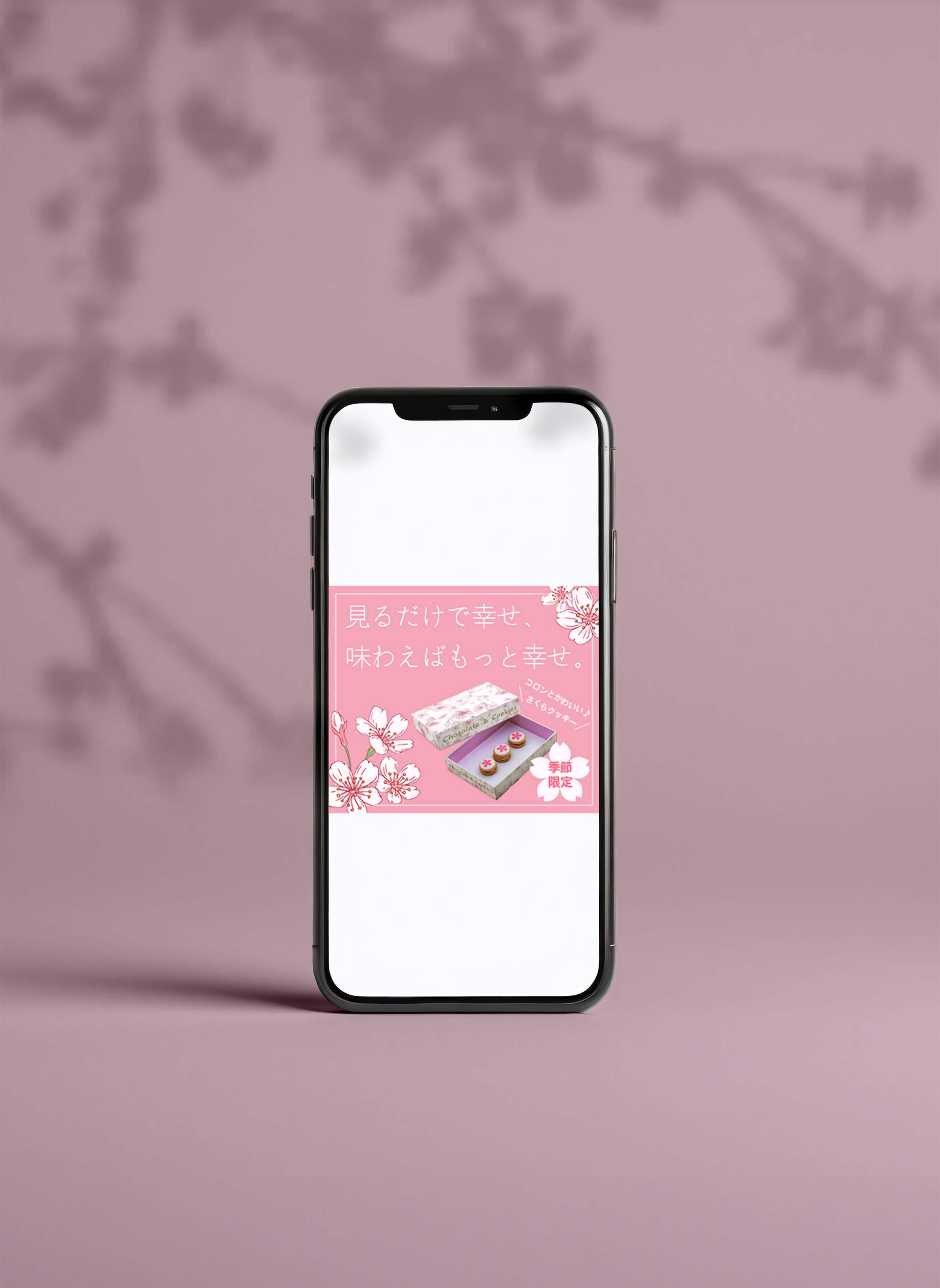
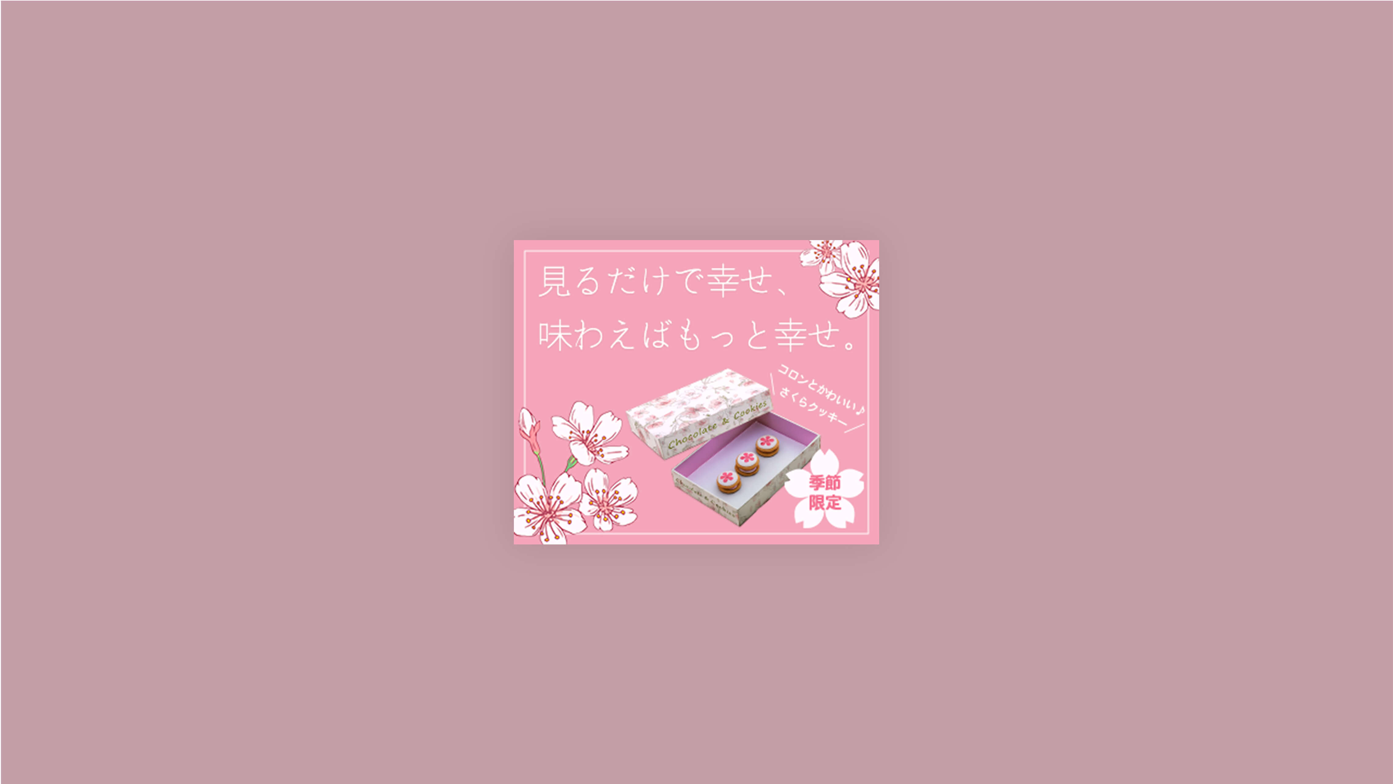
思わず飾りたくなる、美しいショコラクッキー
(ja)
架空の洋菓子店が販売するサクラクッキーのバナーを制作しました。パッケージデザインやコンセプト、ターゲット層、価格帯などはすべてクラスメイトが考案したもので、それらの情報をもとにバナーを制作したため、実際の業務に近い形で取り組むことができました。春らしくやさしい印象を与えるデザインを意識し、商品の魅力が伝わるよう工夫しています。
(en)
I created a banner for a fictional confectionery shop promoting their seasonal sakura cookies. The packaging design, product concept, target audience, and pricing were all developed by a classmate, allowing me to work in a setting that closely resembled a real client project. I focused on creating a gentle, spring-inspired visual impression that would effectively highlight the product’s charm.
(詳細)DETAILS
(jp)
- ターゲット
- 30~50代の男女、カップル、夫婦。
- 目的
- 春限定の新商品であることを伝える。購買意欲を高め、購入に繋げる。
- コンセプト
- 食べるのがもったいない、飾っておきたいショコラクッキー
- デザイン
- 商品のコンセプトをもっとも伝えたかったため、それをキャッチコピーに反映させました。味や力強さではなく、ビジュアルと繊細さに焦点を当てたかったので、キャッチコピーにはやや細めのフォントを使用し、余白も活かしながら、儚さや軽やかさを表現しています。また、「季節限定」というサブキャッチには、商品の可愛らしさや親しみやすさも感じてもらえるよう、丸みのあるゴシック体を選びました。
- 制作期間
-
デザイン2日
- 使用ツール
- Photoshop
(en)
- Target
- Men and women in their 30s to 50s, including couples and married pairs.
- Objectives
- To let customers know this is a seasonal spring item, with the goal of boosting purchase motivation.
- Concept
- A chocolate cookie so beautiful, you’ll want to display it rather than eat it.
- Design
- The banner design focuses on expressing the product’s core concept, which is reflected in the main catchphrase. Rather than emphasizing flavor or intensity, I aimed to highlight the visual appeal and delicacy of the product. A slightly thinner font was used for the main text, with generous white space to convey a sense of lightness and fragility. For the sub-caption, “Limited Seasonal Edition,” I chose a rounded gothic typeface to evoke a sense of charm and approachability, while complementing the product’s cute and delicate image.
- Prouction Time
-
Design2 days
- Tools Used
- Photoshop


