WORK
(ORIGINAL WORK)Portfolio
(概要)OUTLINE
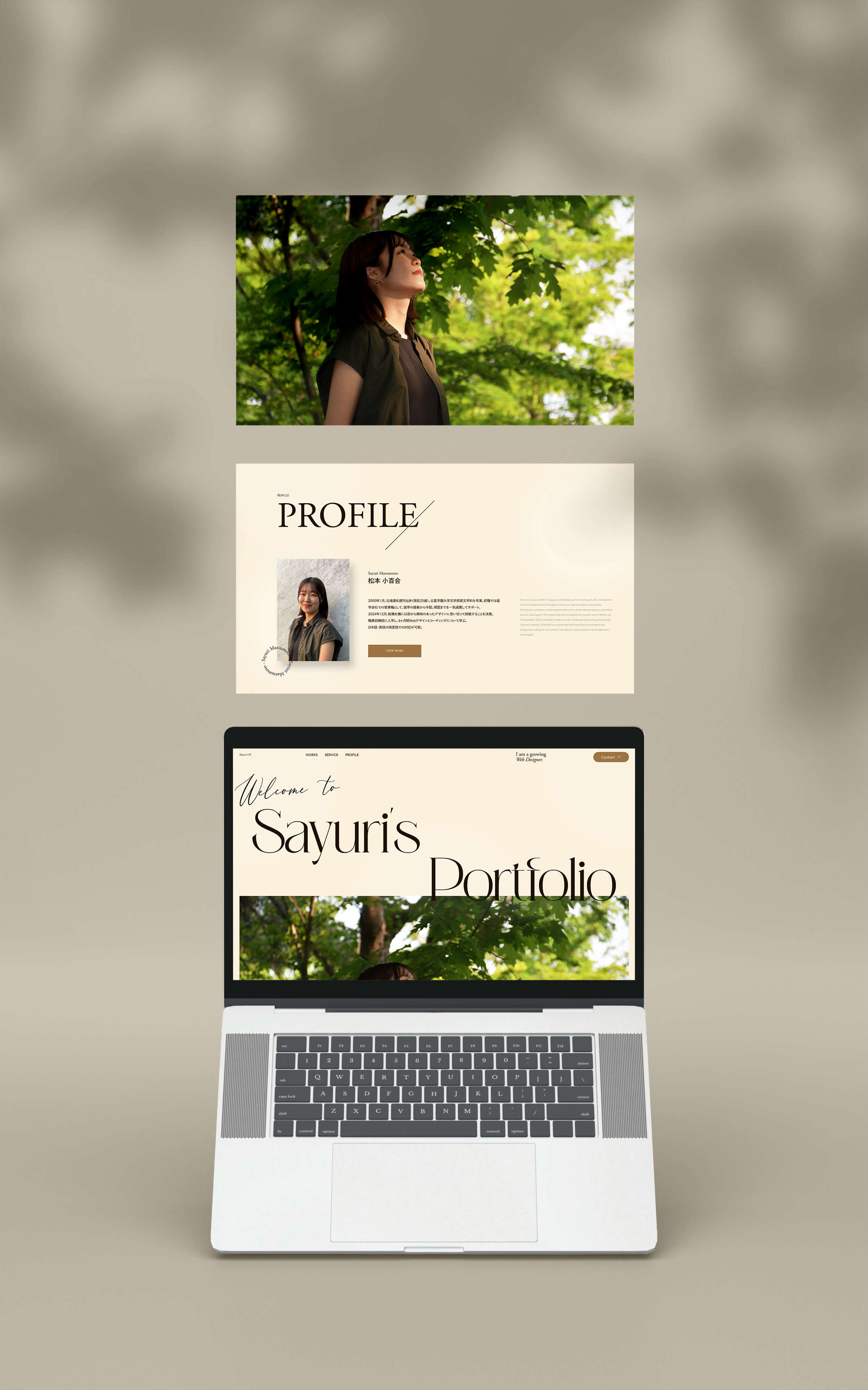
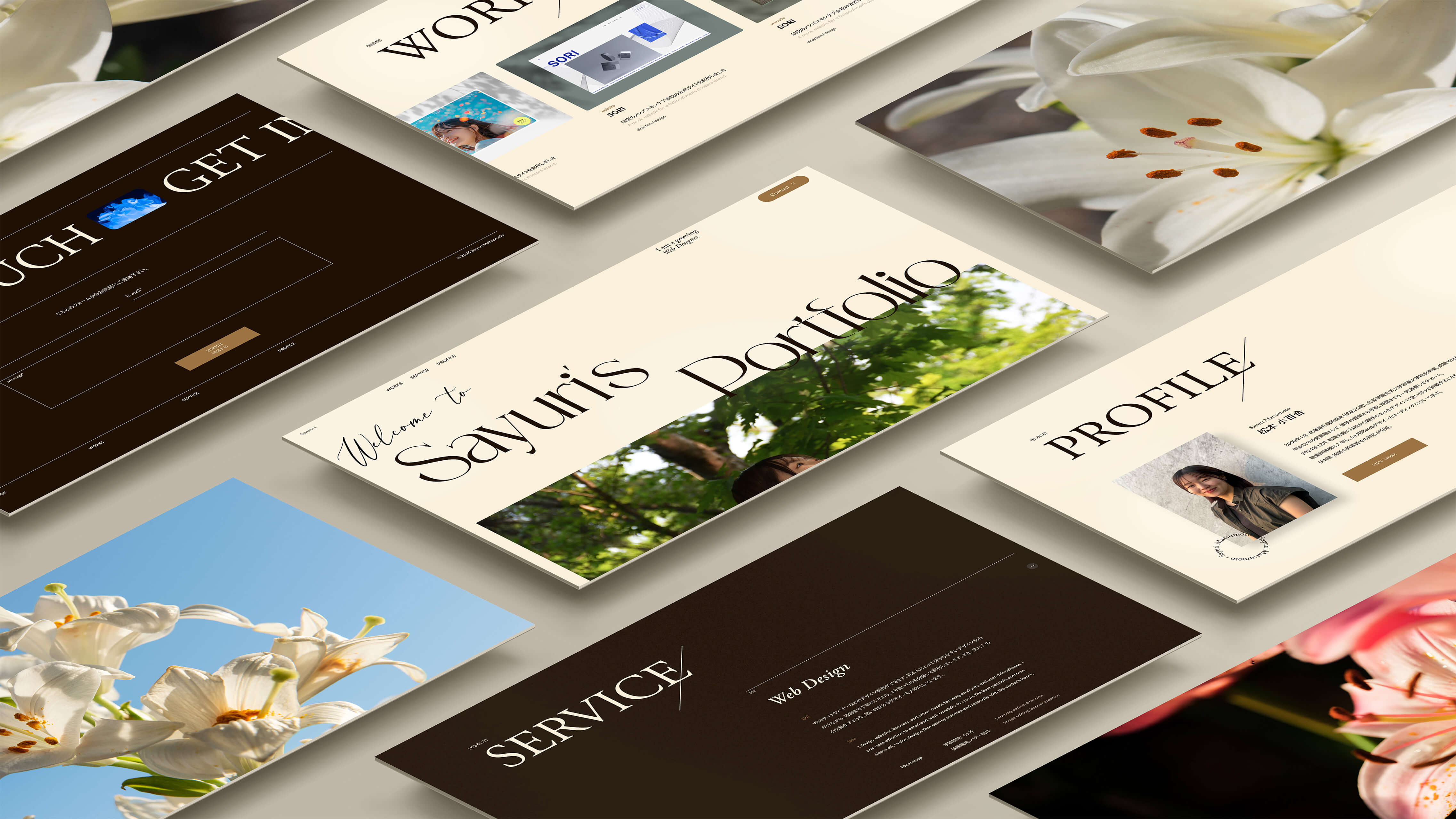
デザインと生きる未来を目指して。
(ja)
職業訓練校での学びの集大成としてポートフォリオサイトを制作しました。サイトをご覧いただく採用担当者の方々を意識し、わかりやすい情報設計を第一に考えデザインしました。実際に会って話してみたいと思っていただくことを目標にして制作しました。
(en)
I created a portfolio website as the culmination of my studies at a vocational training school. With hiring managers as the primary audience, I focused on clear and intuitive information architecture throughout the design. My goal was to create a website that not only showcase my skills, but also makes viewers feel, “I’d like to meet and talk to this person.”
(詳細)DETAILS
(jp)
- ターゲット
- 採用担当者の方々。
現場担当者の方々。 - 課題
- 自身の作品をまとめたサイトがない。書類では伝わりにくい人柄、コーディングのスキル、デザイナーとしてなぜそのデザインにしたかを表現する機会がない。
- 目的
- 転職活動の書類選考を通過する。実際に会って話してみたいと思っていただく。成長に期待していただく。
- コンセプト
- しなやかに、まっすぐに。
私自身の内面を表すキャッチコピーです。
しなやか→自己中心的な意味ではなく、柔軟性をもって
まっすぐ→自身の軸
サイト全体の雰囲気として、名前の由来である「百合の花」をイメージしています。 - 情報設計
- 今回の制作では、ユーザーである採用や現場担当者の方々の立場に立って設計することに最も注力しました。また、作品ページは階層が多く複雑になりやすいと考えたため、別途パンくずリストを配置し、ユーザーが迷わずいつでも一覧ページに戻ることができ、今自分がどこにいるか視覚的に確認できるよう工夫しました。
- デザイン
- サイト全体のデザインは、「上品さ」「凛とした佇まい」「洗練」「信頼感」「親しみやすさ」の5つのキーワードを軸に制作しました。ファーストビューの手書き風フォントやスラッシュのあしらいは、コンセプトである「しなやかさ」、そして私自身の軸として大切にしている「まっすぐさ」を表現しています。また、強みの一つである語学力を活かし、タブレット版以上では日本語と英語の両方を併記しています。主な閲覧者は日本人を想定しているため、日本語が自然に主役となるよう、フォントサイズや文字幅、カラー設計に注意を払い、両言語の情報量のバランスに配慮しました。優先順位に大きな差をつけすぎず、読み進めるべき情報が自然に目に入るよう意識しています。カラー設計では、全体に凛とした印象を持たせるためブラックを基調にしつつ、過度に重く冷たい印象にならないよう、ベージュを差し色として取り入れ、柔らかさと温かみを加えました。
- 意識したポイント
-
① ユーザー目線での情報設計
今回の制作では、主な閲覧者である採用担当者の視点を意識し、情報設計に特にこだわりました。中でも関心が高いと考えられる制作物をファーストビュー直後に配置することで、迷わずすぐに見ていただけるようにしました。特に見ていただきたい制作物はTOPページに並べ、それ以外はボタンから一覧ページへ遷移できるようにしています。また、各作品の詳細ページでは、冒頭にリスト形式で概要をまとめ、併せてWebサイトやPDFへのリンクボタンを配置することで、ページにアクセスした際に、知りたい情報へすぐに辿り着ける構成にしています。デザインの意図や背景など丁寧に伝えるべき箇所は十分な文章量を取り、それ以外は簡潔にまとめるなど、情報のメリハリと読みやすさにも配慮しました。② 自分らしさを出すこと
情報設計だけでなく、全体のトーンやビジュアルを通して「私らしさ」が自然に伝わることも意識しました。フォントやあしらいには、凛とした空気感を感じさせる要素を取り入れ、落ち着いた中にも芯のある印象を与えられるよう工夫しています。特に、TOPページではやや大きめのフォントや余白を活かしたレイアウト、手書き風フォントやスラッシュのあしらいなどで、しなやかさとともに「ぶれない軸」や「大胆さ」といった私自身の特徴を表現しました。また、採用担当者の方々は多忙で、限られた時間の中で多くの応募者に目を通す必要があると考えたため、第一印象で「なんかよさそう」と感じてもらえるよう、特にTOPページは意識して制作しました。 - 制作期間
-
企画 / 情報設計 / WF4日デザイン2週間コーディング2週間
- レスポンシブ対応
- あり
- 使用ツール
- Figma, Photoshop, VScode
(en)
- Target
- Hiring managers. On-site team managers.
- Challenges
- I didn’t have a portfolio website to showcase my work. It is difficult to express my personality, coding skills, and design decisions through resumes alone.
- Objectives
- To pass the document screening phase of job applications, spark interest from recruiters, and make them want to meet me. To convey my potential for growth.
- Concept
- Amiable and Steady.
- Information Architecture
- I focused most on designing from the perspective of the user—recruiters and hiring teams. Since portfolio pages often have deep and complex structures, I added breadcrumb navigation to help users quickly return to the main list and clearly see where they are within the site.
- Design
- The overall design is based on five key words: elegance, quiet confidence, refinement, credibility, and approachability. The handwritten-style font and slash details in the hero section express both gracefulness and the honesty that I value. To highlight one of my strengths—language skills—I included both Japanese and English from tablet view upward. Since the primary audience is Japanese, I designed the typography to ensure Japanese remains the visual focus. Font size, line width, and color were all carefully adjusted for balance between the two languages. For the color scheme, black was used as the base to create a poised atmosphere, while beige was added as an accent to soften the look and add warmth.
- Key Points
-
1. User-Centered Information Architecture
I paid special attention to how recruiters would interact with the site. To help them find what they’re most interested in right away, key projects are placed immediately after the hero section. Featured works are displayed on the top page, with a button to view the full list. On each project detail page, an overview is presented at the top in list format, along with direct links to websites or PDFs, so users can quickly find the information they need. I included detailed descriptions where context matters, while keeping other areas concise to maintain readability and flow.2. Expressing My Personality
Beyond structure, I aimed to communicate who I am through the tone and visuals of the site. Elements like font choice and graphic accents are designed to convey calm confidence and clarity. On the top page, I used larger typography, generous whitespace, handwritten font accents, and bold layout choices to express both my gracefulness and strong personal values. Knowing that recruiters often have limited time to review many applications, I focused especially on the first impression—crafting a top page that makes people think, “There’s something nice about this.” - Prouction Time
-
Planning / Information Architecture / Wireframes4 daysDesign2 weeksCoading2 weeks
- Responsive Design
- Implemented
- Tools Used
- Figma, Photoshop, VS code