WORK
(SCHOOL WORK)NEXTONE
-
Client
NEXTONE SAPPORO
-
Date
2025.02
-
Role
design
-
Tools
Figma, Photoshop
(概要)OUTLINE
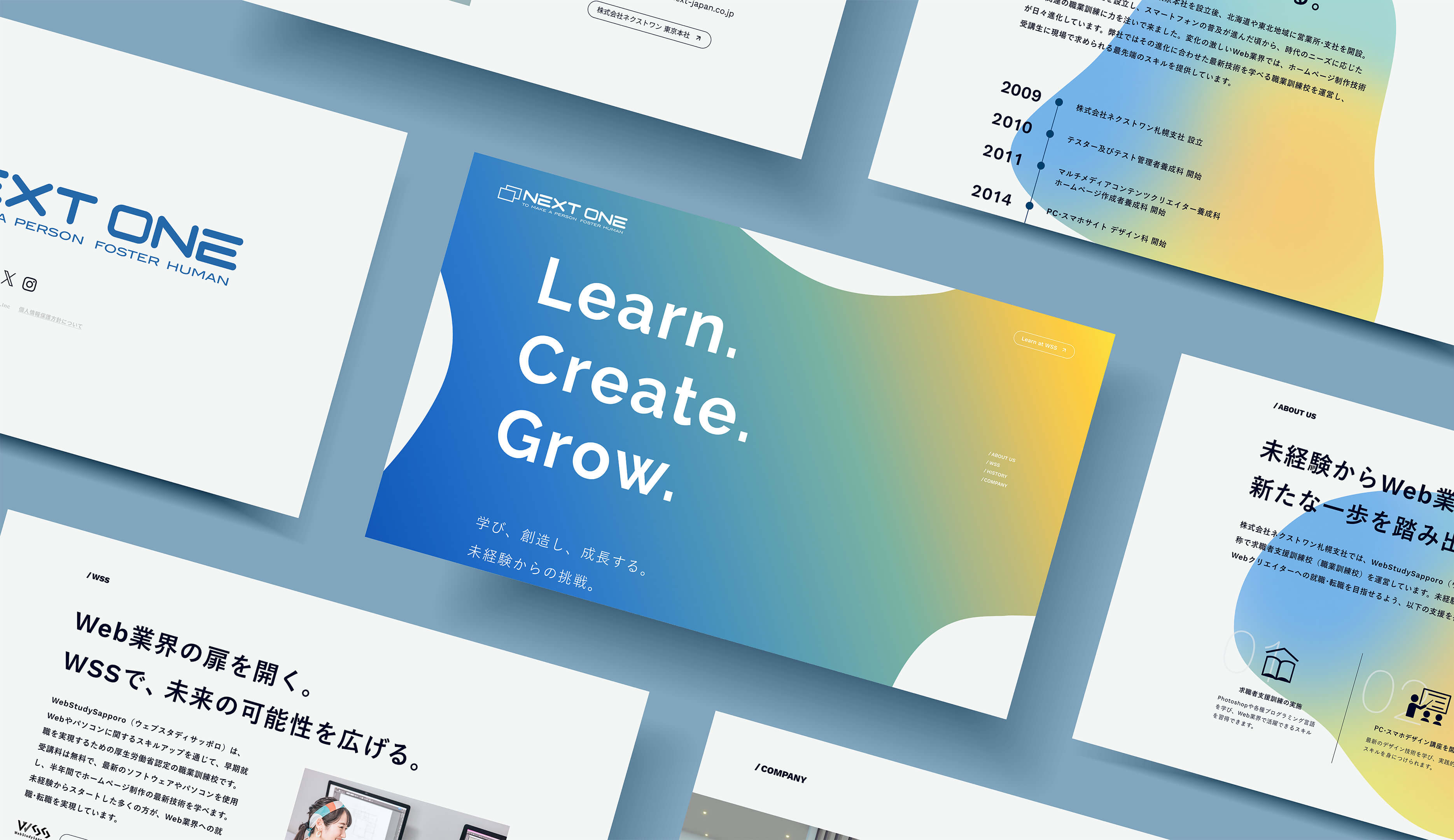
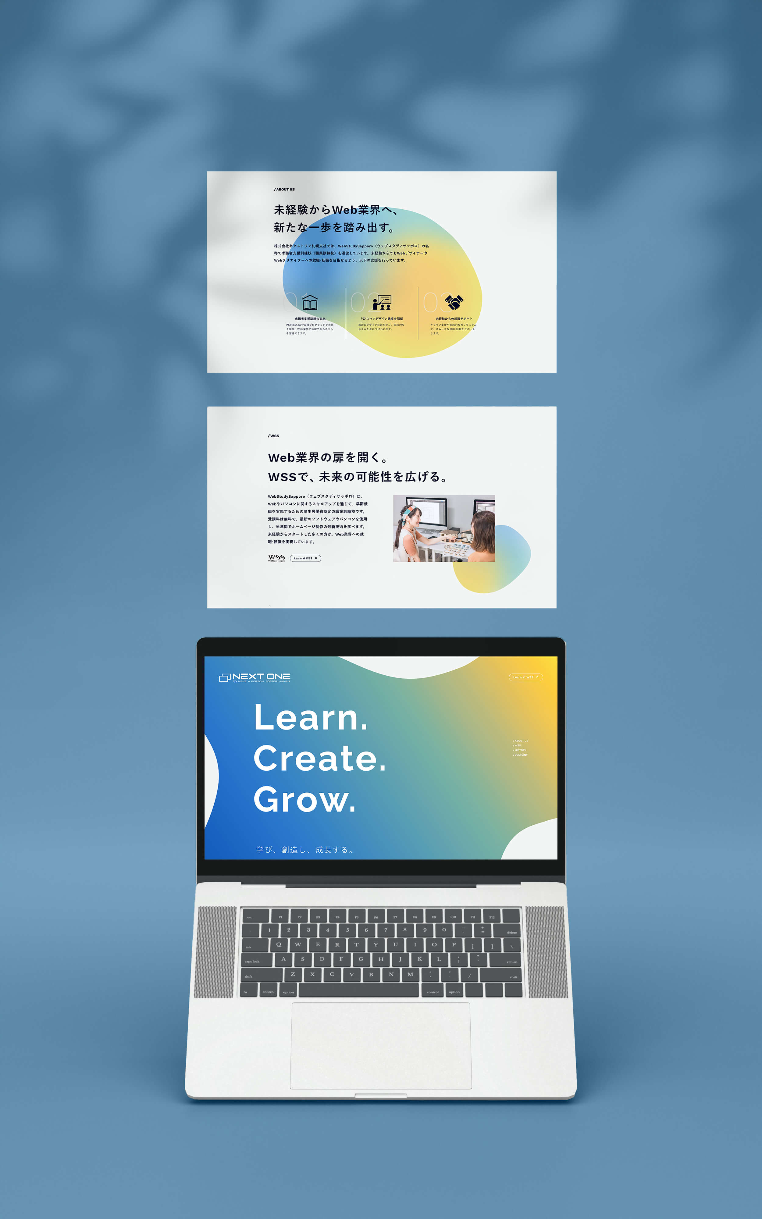
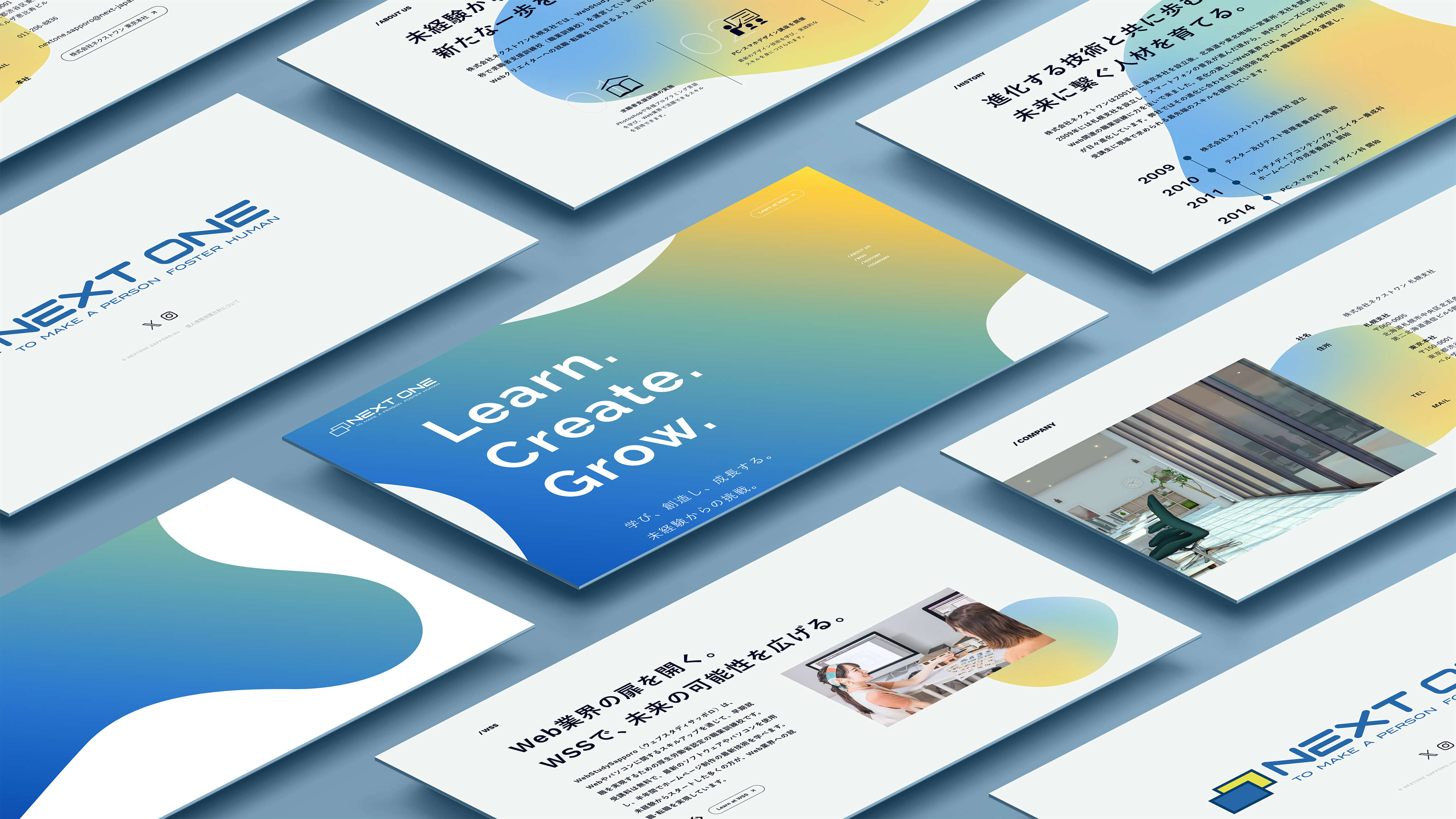
未経験からWeb業界へ。未来の人材育成に貢献する。
(ja)
株式会社ネクストワン札幌支社のリニューアルサイトを制作しました。メインビジュアルにはグラデーションを活かした流体シェイプを用い、トレンドを取り入れつつ、企業の信念や主力事業である「WSS(ウェブスタディサッポロ)」の受講生の姿を表現しています。サイトを通じて企業への信頼と安心感が伝わるよう心がけました。
(en)
I created a renewal website for Next One Co., Ltd. Sapporo Branch. The main visual features a fluid shape design enhanced with gradients, combining current design trends with expressions of the company’s core values and its primary service: WSS (Web Study Sapporo). Throughout the site, I aimed to convey a sense of trust and reliability toward the company.
(詳細)DETAILS
(jp)
- ターゲット
- WSSの受講を検討している方。
取引先や関連企業の方々。 - 課題
- 現行サイトでは未来の人材育成に貢献する企業であることや、職業訓練校を運営していることが伝わりづらい。デザインも古く、ビジュアル要素がほとんどない。
- 目的
- 職業訓練校を運営していることをわかりやすく伝える。企業としての信頼感を損なわない範囲で、トレンドを取り入れた新しいデザインにする。
- コンセプト
- THE NEXT STEP TO YOU.
- 情報設計
- WSSの受講を検討している方がサイトの主なユーザーであると想定し、ファーストビューには大きくキャッチコピーを配置。本文とあわせて企業の信念を伝える構成とし、第一印象で信頼や安心感を与えられるよう設計しました。コーポレートサイトとしての信頼性はもちろんですが、「なんとなく信頼できそう」と受講希望者に感じてもらえることが、実際の応募につながる大きな分岐点になると考え、コピーや文章の構成にこだわりました。
- デザイン
- 配色には、株式会社ネクストワン本社のコーポレートカラーを使用しました。サイト全体には流体シェイプとグラデーションを取り入れ、企業の信念と、学びの中で課題に向き合いながらも未来へと成長していく受講者の姿、そしてその受講者の無限の可能性を表現しました。ファーストビューではグラデーションを左下から右上へ流すことで、未来に向かって進むような、明るい印象を表現しています。また、ファーストビューのキャッチコピーと冒頭2行を1画面内に収めることを想定しており、文章の冒頭で区切ることで、スクロールを促す構成としました。さらに、既存サイトにはなかったリストや表などの図を活用し、情報をよりわかりやすく伝えられるよう工夫しています。
- 意識したポイント
-
① トレンドを取り入れたデザイン
現行サイトはシンプルなレイアウトで、アニメーションもなく静的な印象でした。そこで今回のリニューアルでは、インパクトのある大きなタイポグラフィをファーストビューに使用し、動きのある流体シェイプとグラデーションを組み合わせています。中でもファーストビューは、タイポグラフィによってメッセージ性を強く打ち出しており、「未来の人材育成に貢献する企業である」という信念と強く結びつくデザインとなっています。② WSSへの誘導
WSSに関する情報を多く掲載しているため、興味を持った方がすぐに詳細へアクセスできるよう、ヘッダーや各セクション内にWSS公式サイトへのリンクを配置しました。ビジネス関係者、一般ユーザーいずれにとっても目的の情報にスムーズにたどり着けるよう配慮しています。また、「WSSセクション」や「COMPANYセクション」には写真を配置し、セクションの内容が一目でわかるよう工夫しました。特にWSSセクションでは、笑顔の女性がパソコンの画面を指し示す写真を用いることで、ユーザーに実際の学習風景をイメージしやすくし、親しみと安心感を与えられるようにしています。 - 制作期間
-
情報設計 / WF2日デザイン3日
- レスポンシブ対応
- なし (1920x1080で制作)
- 使用ツール
- Figma, Photoshop
(en)
- Target
- Individuals considering enrolling in WSS. Business partners and related organizations.
- Challenges
- The current website did not clearly communicate that the company contributes to the development of future professionals or that it operates a vocational training school. The design was outdated and lacked visual elements.
- Objectives
- Clearly convey that the company operates a vocational training school. Refresh the site with a modern, trend-conscious design without compromising corporate credibility.
- Concept
- THE NEXT STEP TO YOU.
- Information Architecture
- Assuming the primary users are those considering WSS, I placed a large, impactful catchphrase in the hero section to establish trust and clarity from the first view. Together with the accompanying text, the structure effectively communicates the company’s values. While maintaining the reliability expected of a corporate website, I focused on crafting copy and content flow that would make visitors feel a subtle sense of trust—something that often determines whether users decide to apply or not.
- Design
- The site uses the corporate color palette of Next One’s headquarters. Fluid shapes and gradients are incorporated throughout the layout to represent the company’s commitment to nurturing future professionals and the growth of its students as they face challenges and move forward. In the hero section, a gradient flows from the lower left to the upper right, symbolizing a bright path toward the future. The headline and first two lines of text are intentionally kept within the first viewport, with a line break at the start of the text to encourage users to scroll further. To enhance clarity, I also utilized visual aids such as lists and tables, which were absent in the previous site.
- Key Points
-
1. Trend-Inspired Design
The old website had a static, plain layout with no animations. In the renewal, I used bold typography in the hero section and combined it with dynamic fluid shapes and gradients. The typography plays a crucial role in reinforcing the message that the company is dedicated to developing future talent.2. Seamless Navigation to WSS
Given the substantial content related to WSS, I included direct links to the official WSS website in the header and various sections to ensure users can easily access more information. Whether they are business partners or prospective students, all visitors can quickly find what they are looking for. Photos were also added to the "WSS" and "Company" sections to help users instantly understand the content. In particular, the WSS section features an image of a smiling woman pointing at a computer screen, allowing visitors to imagine the actual learning environment and fostering a sense of friendliness and security. - Prouction Time
-
Planning / Information Architecture / Wireframes2 daysDesign3 days
- Responsive Design
- Not supported (Designed for 1920x1080)
- Tools Used
- Figma, Photoshop