WORK
(SCHOOL WORK)Café Lavande
-
Client
ORIGINAL WORK
-
Date
2025.02
-
Role
direction, design
-
Tools
Figma, Photoshop
(概要)OUTLINE
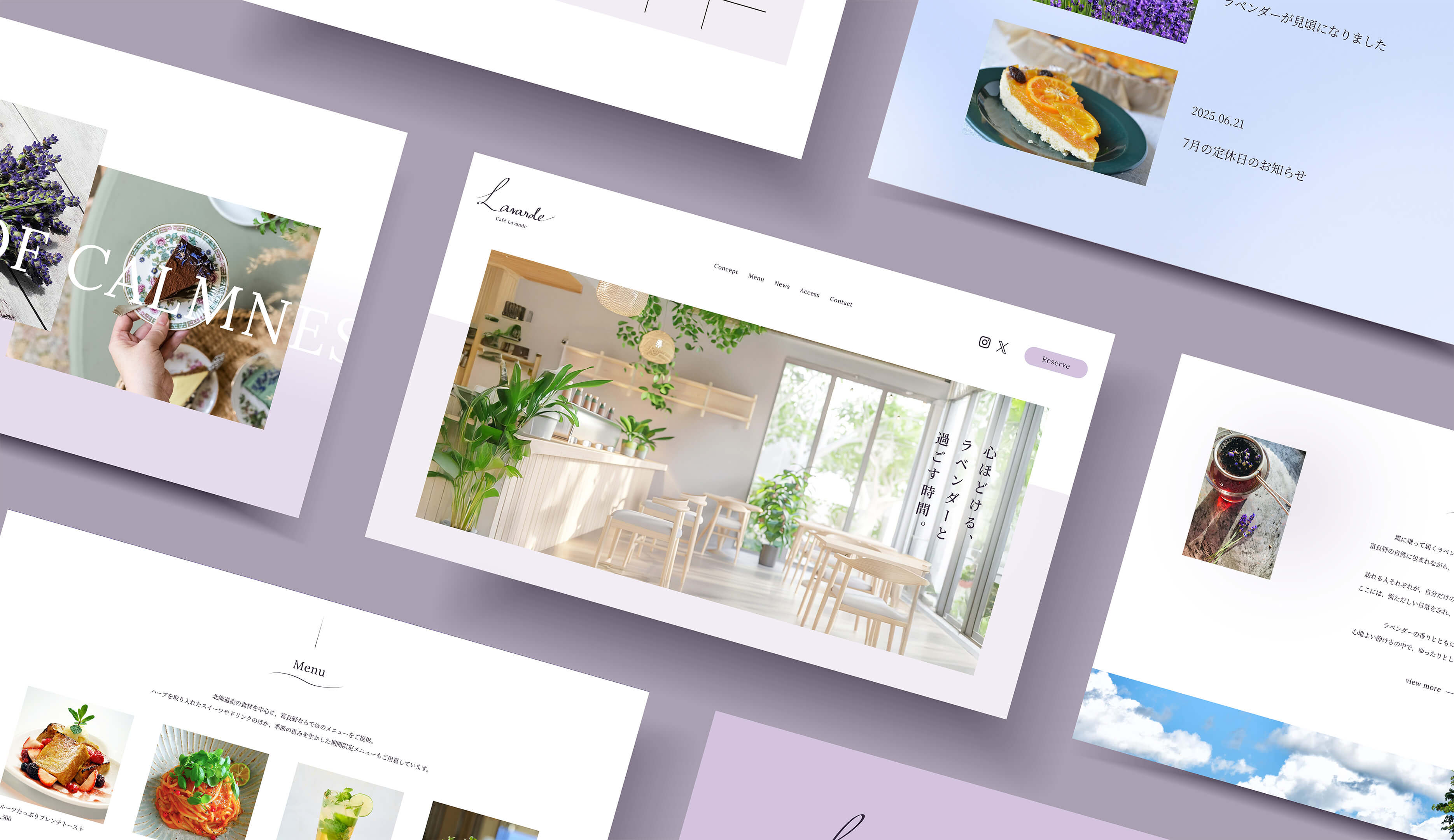
富良野の風に包まれて、ラベンダーの香るひとときを。
(ja)
架空の富良野にあるカフェの公式サイトを制作しました。女性の観光客をターゲットにしており、サイトから富良野の自然とゆったりとした雰囲気、癒しを感じていただけるよう工夫しました。
(en)
I created a fictional website for a fictional cafe in Furano, Hokkaido. The target audience is female tourists, and the site is designed to convey the natural beauty and relaxing atmosphere of Furano, offering a sense of healing through both visuals and layout.
(詳細)DETAILS
(jp)
- ペルソナ
- 30代女性。普段は都会で忙しく働いている。
夏に北海道旅行に来た。
花やアロマ、ドライフラワーが好き。
おしゃれでこだわりがある性格。 - 課題
- ラベンダーとカフェの癒しの魅力が、写真だけでは十分に伝わらず、体験の価値が伝わりにくい。観光地は混雑して落ち着かない場所が多いが、旅の途中で息抜きになれるカフェということを伝えたい。
- 目的
- サイトを通して、ラベンダー畑とカフェが提供する「五感で癒される特別な時間」の魅力を伝え、カフェや花畑に訪問してくれるお客様を増やす。
- コンセプト
- 心ほどける、ラベンダーと過ごす時間を届ける場所。
- 情報設計
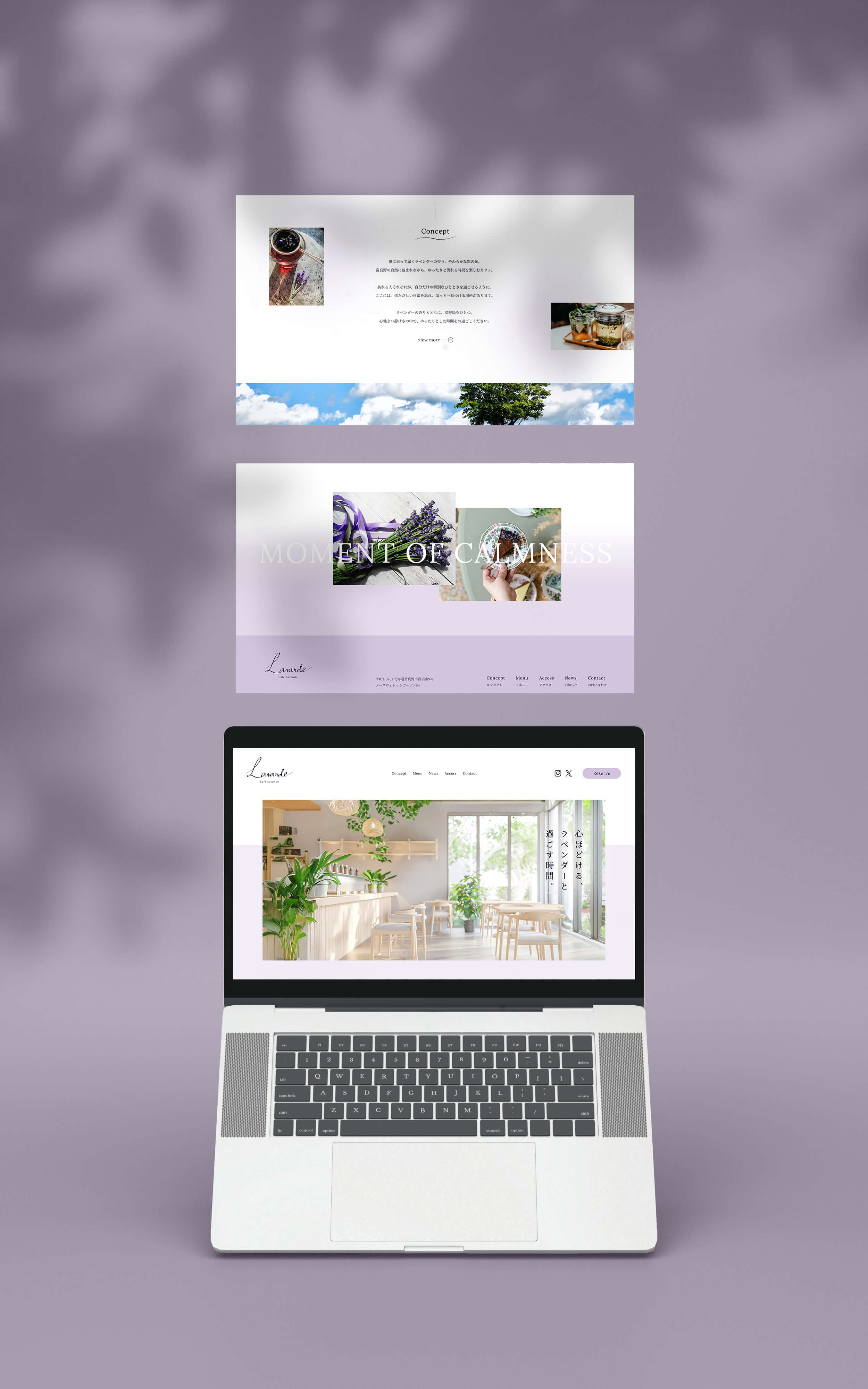
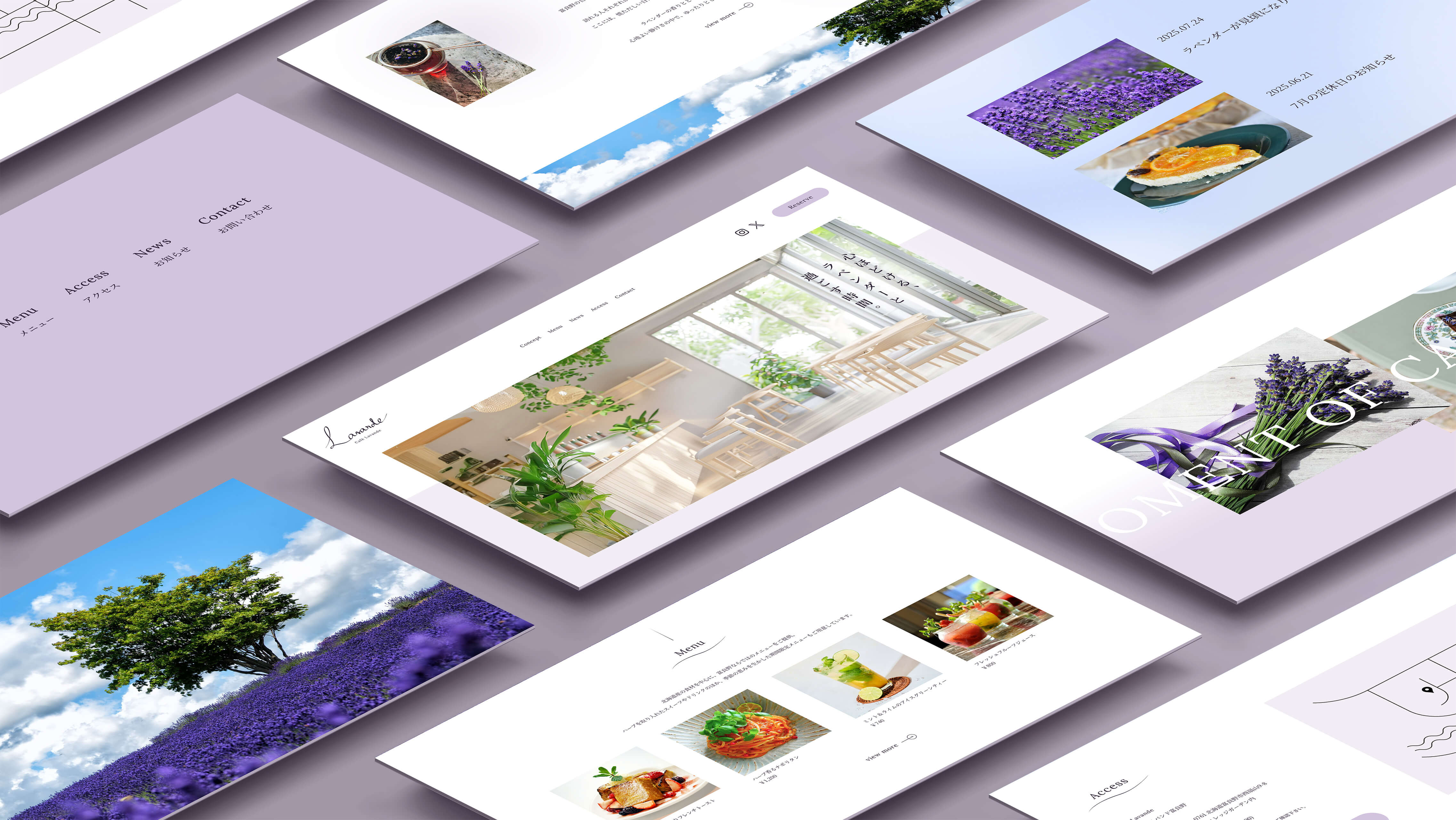
- まず、ファーストビューでユーザーに体験価値を直感的に伝えています。「心ほどける、ラベンダーと過ごす時間。」というキャッチコピーと、明るく柔らかい店内の写真を通して、カフェのサイトであること、また「ここで過ごす時間=癒し」ということがすぐに伝わる構成になっています。セクション構成を来訪目的のユーザーに合わせ、どこにあるのか、何が楽しめるカフェなのか、現在の見どころ、どうやって行けるかという疑問に自然に答えています。
- デザイン
- 配色にはやわらかく穏やかな雰囲気を表現するため、全体的に淡いトーンを採用しました。メインカラーであるパープルを際立たせるため、サイト全体の配色はシンプルに構成し、ベースカラーとしてホワイトを広く使うことで、清潔感と抜け感を演出しています。アクセントカラーにはブルーを使用し、背景にはマーブル模様を取り入れることで、ゆったりとした空気感と、爽やかな空を思わせる印象を表現しました。また、タイトル部分にはウェーブのあしらいを用い、富良野の風やラベンダーの香りを感じさせるような、やさしく心地よい雰囲気を表現しています。
- 意識したポイント
-
① 世界観を統一したビジュアル設計
写真、配色、フォント、あしらいなど全ての要素をコンセプトに合わせた「やわらかさ」「癒し」「ラベンダーカフェの世界観」に統一しています。こうすることで、サイトを訪れたユーザーが感覚的に魅力を感じ、「実際に足を運んでみたい」と思えるような体験設計を目指しました。また、ロゴはイラストレーターを使って手書きで自作しました。② 広い余白
各セクションや要素の間に十分なスペースを設けることで、カフェのゆったりとした雰囲気を演出できるようにしました。セクションごとの余白や行間など、全体的に余白を広めにとることを意識しました。 - 制作期間
-
企画 / 情報設計 / WF4日デザイン1週間
- レスポンシブ対応
- なし (1920x1080で制作)
- 使用ツール
- Figma, Photoshop
(en)
- Persona
- A woman in her 30s who usually lives a busy life in the city. She is visiting Hokkaido in the summer. She loves flowers, aromatherapy, and dried floral arrangements. Stylish, with a strong sense of personal taste and attention to detail.
- Challenges
- The healing charm of lavender and the cafe is difficult to fully convey through photos alone, making it hard to communicate the value of the experience. Many tourist spots are crowded and overwhelming, but I wanted to express that this cafe offers a peaceful break in the midst of travel.
- Objectives
- Objectives To attract more visitors to the cafe and lavender field by conveying the unique, multi-sensory healing experience the space offers through the website.
- Concept
- A place where you can unwind and spend time with lavender.
- Information Architecture
- The first view of the website instantly communicates the experiential value. The catchphrase “A moment to unwind, surrounded by lavender” and a bright, gentle photo of the cafe’s interior help users immediately understand that this is a relaxing cafe. The layout is structured to naturally answer key questions from visitors: Where is it? What can you enjoy? What's in season? And how can you get there?
- Design
- Soft, gentle tones were used throughout to express a calm atmosphere. To highlight the main purple color (lavender), the overall color scheme is kept simple, with plenty of white as a base to create a sense of cleanliness and openness. A blue accent color was added, and marble patterns were used in the background to evoke a spacious, airy feeling reminiscent of a fresh summer sky. Wave motifs were incorporated into the titles to evoke the gentle breeze of Furano and the soothing scent of lavender, creating a calm and comfortable visual impression.
- Key Points
-
1. A Consistent Visual Worldview
All visual elements—photos, colors, fonts, and decorative motifs—were unified under the concept of softness, healing, and the world of a lavender cafe. This helps visitors intuitively feel the charm of the place and imagine themselves actually being there. The logo was hand-drawn by using Illustrator.2. Generous Use of White Space
Ample space between sections and elements creates a relaxed, airy layout that reflects the café’s atmosphere. Special attention was paid to spacing and line heights, ensuring that every part of the site feels unhurried and easy to take in. - Prouction Time
-
Planning / Information Architecture / Wireframes4 daysDesign1 week
- Responsive Design
- Not implemented (designed for 1920×1080 screen resolution)
- Tools Used
- Figma, Photoshop