WORK
(ORIGINAL WORK)Halora
(概要)OUTLINE
空間に寄り添うインテリアランプの美しさを伝える。
(ja)
架空のインテリアランプ会社の公式サイトを制作しました。スタートアップブランドで認知度をこれから高めていく段階のため、第一印象で惹きつけられるようなビジュアル設計を目指しました。また、架空のブランドであるため、コンセプトの設定にあたりインテリアランプを求める人はどんなお客様なのか、ターゲットやペルソナの設定など情報収集に時間をかけるようにしました。
(en)
I created a fictional website for a startup interior lamp brand. Since the brand is in its early stage and still building awareness, I focused on visual design that would make a strong first impression and capture attention immediately. I also paid close attention to photography and the use of white space to fully convey the brand’s appeal.
(詳細)DETAILS
(jp)
- ターゲット
- 30代〜50代の忙しく働く男女。
家など自分の空間づくりにこだわりがある人。
シンプルで質のよいものが好きな人。 - 課題
- 最近インテリアランプのブランドを立ち上げた。
SNSを中心に宣伝しているが、なかなか認知度が上がらない。 - 目的
- スタートアップブランドなので、一人でも多くの方にブランドを知ってもらう。
興味を持ってくれた方が購入できるように繋げたい。 - コンセプト
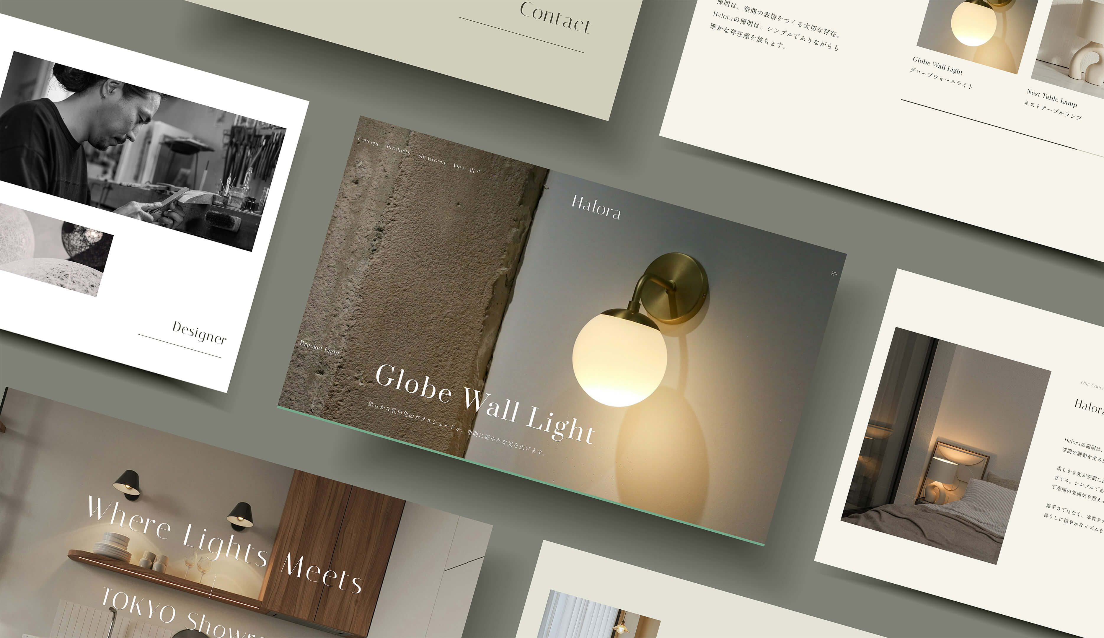
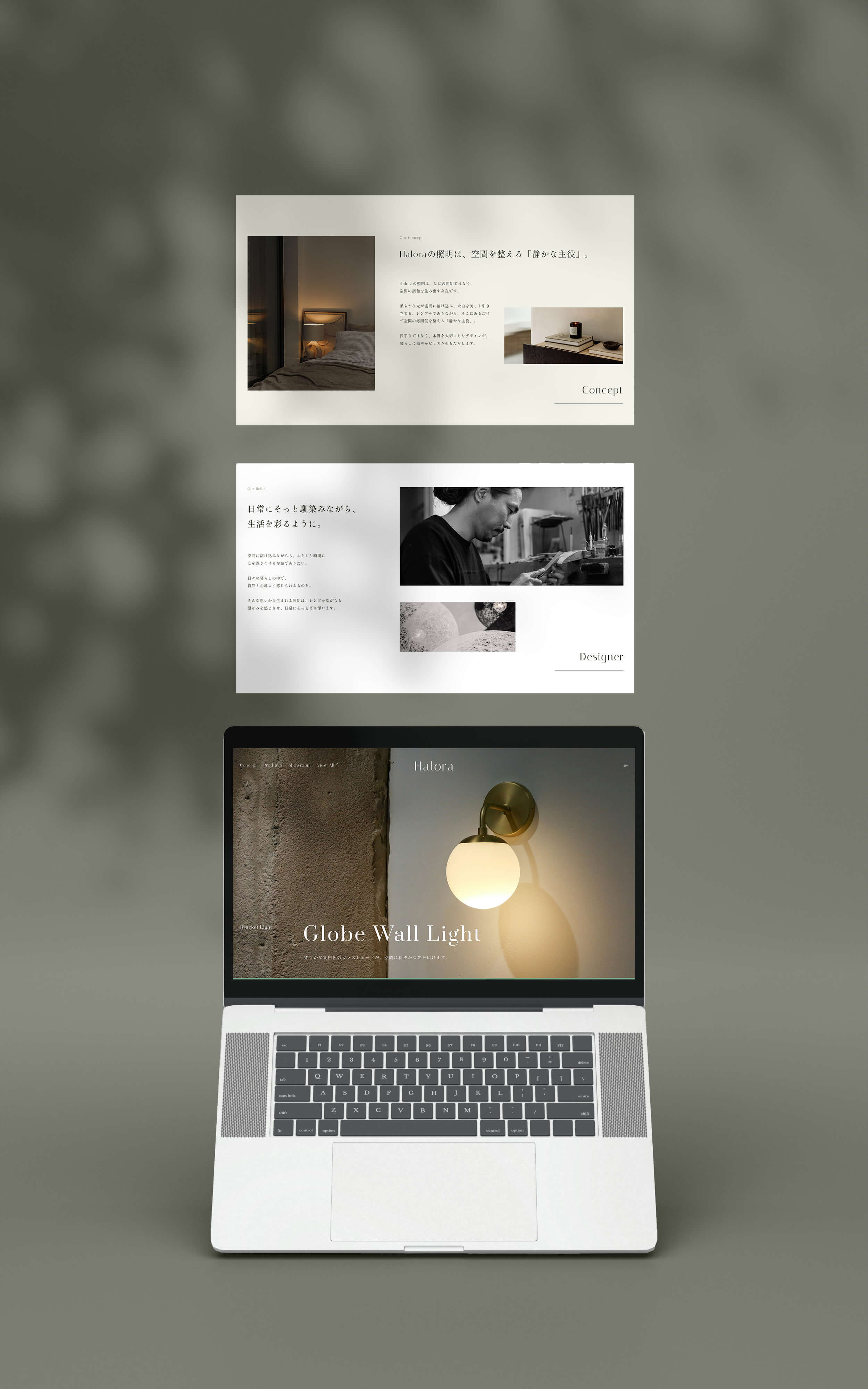
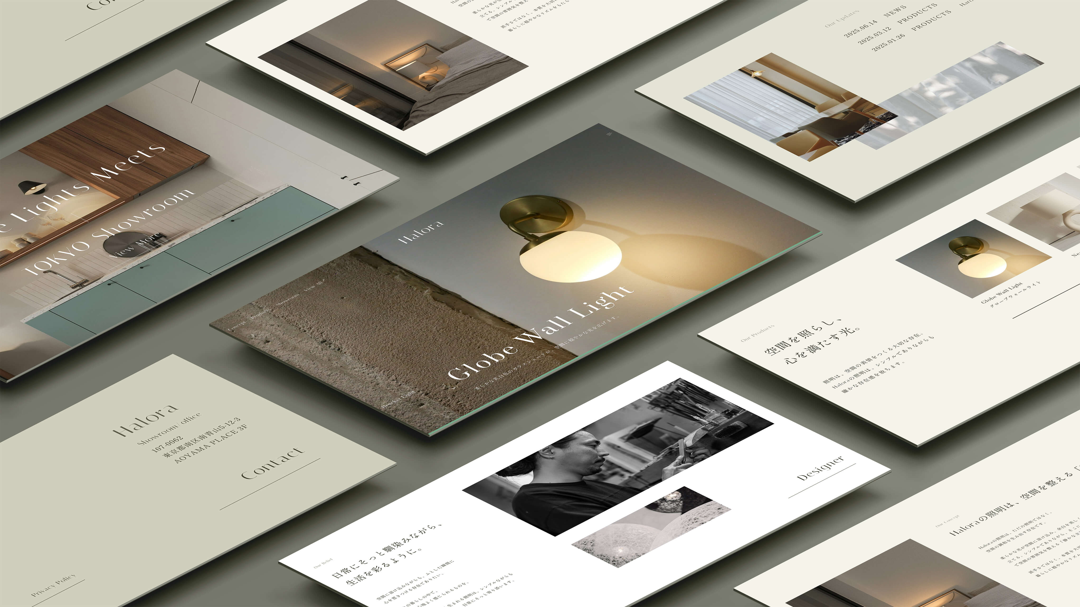
- 空間を整える「静かな主役」。
- 情報設計
- ファーストビューでは、気になったお客様が迷わず欲しい商品にたどり着けるよう、商品の写真だけでなく商品名も載せました。その後のセクションでは、すぐに商品一覧を掲載するのではなく、まずブランドのコンセプトやデザイナーのこだわりを知っていただき、世界観にしっかりと引き込むことで、購買意欲の向上につながると考えました。
- デザイン
-
まだ認知度をこれから高めていく段階のブランドだからこそ、サイト全体の雰囲気づくりにこだわりました。ご覧いただいた方をブランドの世界観に引き込めるよう、写真のレイアウトや余白にも工夫を凝らしています。
サイト全体のゴールとして「どこか新しくて洗練されている」「雰囲気がおしゃれ」と感じてもらえることを目指し、ブランドの印象づけを大切にしています。 - 意識したポイント
-
① 写真のレイアウト
左右に振り分けたり、整列させたり、重ねて配置するなど、単調にならないよう変化をつけ、スクロールに合わせて異なるレイアウトを楽しんでいただけるようにしました。② フォントや余白の扱い方
全体的に質の高さや高級感を演出するために、可読性も加味しながら、全体的にたっぷりと余白をとることを意識しました。フォントの字間を広めにとることで、高級感を演出しながらも、ブランドキーワードの一つである「日常に寄り添うランプ」に合わせ、ゆったり感を出すよう心がけました。 - 制作期間
-
企画 / 情報設計 / WF2日デザイン2日コーディング2日
- レスポンシブ対応
- なし (1920x1080で制作)
- 使用ツール
- Figma, Photoshop, VScode
(en)
- Target / Persona
- Men and women in their 30s to 50s with busy lifestyles. People who care deeply about creating a comfortable and personalized space at home. Those who appreciate simple, high-quality products.
- Challenges
- How to increase the brand awareness.
- Objectives
- To increase recognition and get more people to know about the brand. To connect with those who are interested and lead them to make a purchase.
- Concept
- A “quiet centerpiece” that refines your space.
- Information Architecture
- The first view includes both product images and names so that potential customers can easily find what they’re looking for. Instead of presenting a product list right away, I chose to introduce the brand’s concept and the designer’s vision first. By immersing users in the brand story, the goal is to deepen interest and increase purchasing intent.
- Design
- Since the brand is still in the early stages, I focused on building a strong visual identity throughout the site. To fully convey the brand's world, I carefully designed the photo layout and use of white space. The overall goal was to leave users with an impression of something fresh, refined, and aesthetically appealing.
- Key Points
-
1. Photo Layouts
To keep the visual experience engaging, I varied the layout—placing images side by side, aligning them cleanly, or overlapping them slightly. This variation adds rhythm to scrolling and keeps users interested throughout the page.2. Typography and Whitespace
To convey a sense of quality and elegance, I paid close attention to spacing. Generous white space and increased letter spacing were used to evoke a relaxed, premium feel—matching the brand’s theme of “lighting that blends naturally into daily life.” - Prouction Time
-
Planning / Information Architecture / Wireframes2 daysDesign2 dayscoding2 days
- Responsive Design
- Not implemented (designed for 1920×1080 screen resolution)
- Tools Used
- Figma, Photoshop, VScode