WORK
(SCHOOL WORK)cafe azito
-
Client
SCHOOL WORK
-
Date
2025.02
-
Role
design
-
Tools
Figma, Photoshop
(概要)OUTLINE
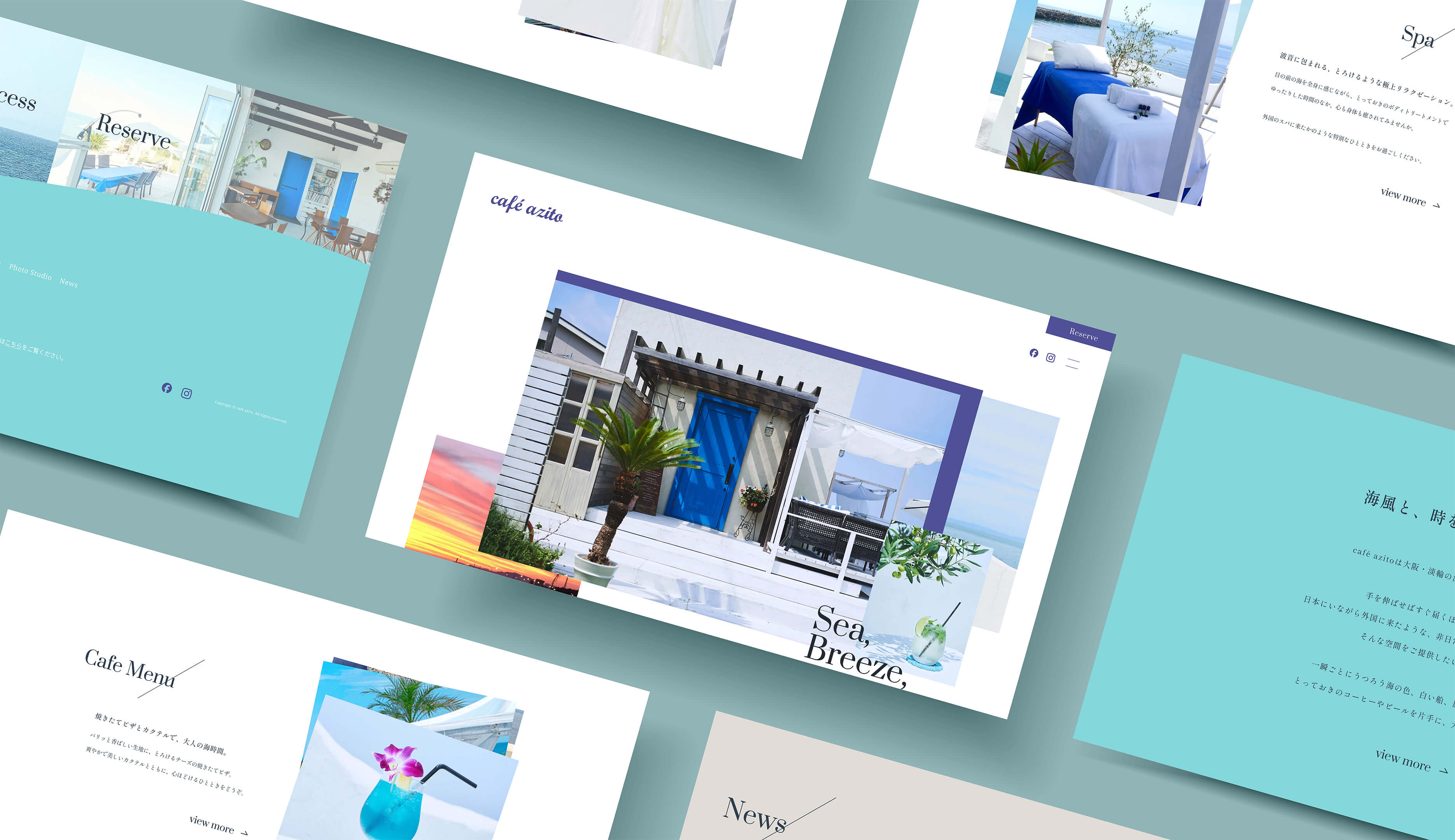
目の前に海を臨む、特別な時間を過ごせる場所。
(ja)
学校課題として、大阪にあるカフェのリニューアルサイトを制作しました。全体を通して爽やかさと非日常感を感じていただけるようなデザインを意識しました。カフェのほかにフォトスタジオやエステなど複数のサービスがあるため、情報に優先順位をつけ、ユーザーにとって分かりやすく整理された構成を意識しました。
(en)
As a school assignment, I redesigned the website for a seaside cafe located in Osaka. The goal was to create a refreshing and extraordinary atmosphere through the design. Since the cafe offers multiple services such as a photo studio and esthetic treatments in addition to food and drinks, I structured the content with clear prioritization to make it easier for users to navigate and find the information they need.

(詳細)DETAILS
(jp)
- ターゲット
- 20代後半〜50代、性別問わずカフェを利用するお客様。
- 課題
- 現行サイトのレイアウトが単調なため、各カテゴリーのコンテンツが分かりづらい。無理やりシングルページで収めようとしており、情報を取得しにくい。グローバルナビゲーションの項目が、一部内容と違う印象で分かりづらい。
- 目的
- ユーザーが情報取得しやすいよう整理し、分かりやすい構成のサイトにする。下層ページを想定し、トップページから下層ページに誘引するようボタンを配置する。
- コンセプト
- 手を伸ばせばすぐ届くほど目の前に海を臨み、日本にいながら外国に来たような、非日常で特別な時間を過ごせる場所。
- 情報設計
- まず、ファーストビューの直後にコンセプトセクションを配置し、ユーザーをサイト全体の世界観へ自然に引き込めるように工夫しました。期間限定で営業しているカフェであることに加え、曜日によって営業時間が異なる点や、カーナビでは場所が正しく表示されないなど、アクセスに不安を感じる要素があると考えました。そのため、アクセスセクションには地図や住所、補足情報を含め、ユーザーが迷わず来店できるよう分かりやすく整理しました。さらに、カフェ利用時のルールについては、ページ冒頭に記載すると来店を迷っている段階のユーザーにとって威圧的な印象を与える可能性があると考えたため、あえてページの最後に配置しています。最後まで読み進めた方に対して、自然な流れでルールを伝えられるよう配慮しました。
- デザイン
- 現行サイトやSNSの投稿内容からターゲットを分析した結果、20代後半〜50代前後の比較的年齢層の高いお客様が多いと考えました。カフェのコンセプトは「海」と「非日常感」の2つがキーワードだと考えたため、全体的に余白を広く取り、開放感のあるデザインを意識しています。ファーストビューの直後にコンセプトセクションを配置し、メインカラーを背景に大きく使うことで視覚的なメリハリを持たせ、セクションごとの区切りが明確になるよう工夫しました。
- 意識したポイント
-
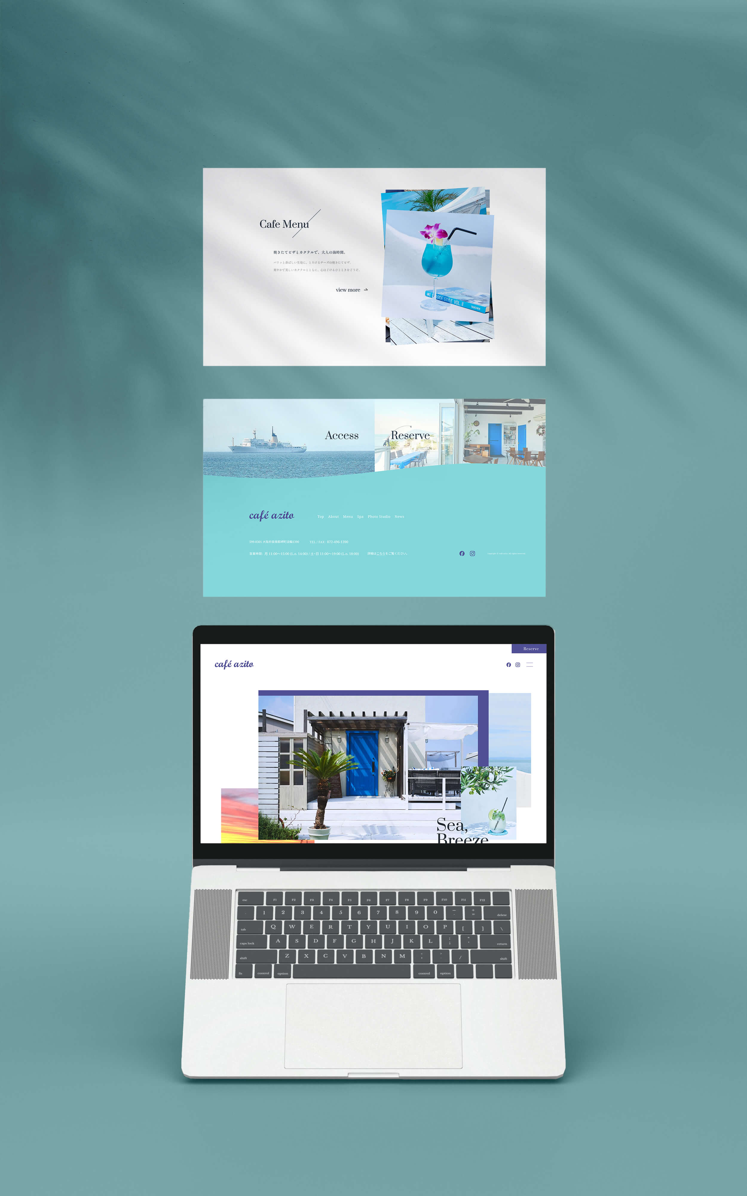
① 情報の優先順位と整理
カフェのほかにフォトスタジオやエステサービスも提供されているため、まずは3つの情報をデザイン上で統一し、同列に並べたうえで、メインであるカフェの情報を最初に配置しました。各カテゴリ内でも優先順位を見直し、ユーザーが目的の情報にスムーズにたどり着けるよう工夫しています。また、現行サイトではSNSリンクがフッターにしか設置されておらず、最後までスクロールしないとアクセスできない点が気になったため、ヘッダーにもリンクを追加し、ユーザビリティを向上させました。② ビジュアルを活かしたレイアウト
ファーストビューや各セクションでは、「海を臨むカフェ」というコンセプトを活かし、海・空・建物の美しさが伝わる写真を大きく使用しました。空間自体がこのカフェ最大の魅力であると考え、直感的に「行ってみたい」と思ってもらえるよう、写真を主役としたレイアウトにしています。また、セクション内では写真をレイヤーのように重ねることで、シンプルながら奥行きを感じられる構成とし、動きや広がりを加えました。さらに、青空や夕暮れなど時間帯ごとに異なる表情を見せる写真を組み合わせることで、カフェの多面的な魅力を表現しました。「いつ訪れても絵になる場所」という印象をユーザーに与えられるよう工夫しています。 - 制作期間
-
情報設計 / WF2日デザイン3日
- レスポンシブ対応
- なし (1920x1080で制作)
- 使用ツール
- Figma, Photoshop
(en)
- Persona
- Customers of all genders in their late 20s to 50s who visit the cafe.
- Challenges
- The current site layout is monotonous, making it hard to distinguish between different categories. All information is cramped into a single page, which makes it difficult to navigate. Some items in the global navigation are misleading and don’t clearly reflect their content.
- Objectives
- To create a well-structured and easy-to-navigate website that allows users to find information effortlessly. The homepage includes buttons that naturally guide users to lower-level pages.
- Concept
- A special place where the ocean is right in front of you—so close you could reach out and touch it. An extraordinary experience that feels like a trip abroad, right here in Japan.
- Information Architecture
- Right after the first view, I placed a concept section to help users naturally immerse themselves in the brand's world. Since the cafe is open only during certain periods and has different business hours depending on the day, as well as some access issues (like inaccurate GPS locations), I addressed these concerns in the access section with maps, addresses, and additional notes for clarity. Regarding the cafe rules, I intentionally placed them at the end of the page instead of at the top to avoid intimidating users who are still deciding whether to visit. This allows the rules to be conveyed in a more relaxed and natural flow for those who have already engaged with the content.
- Design
- Based on an analysis of the current site and social media posts, I assumed that the target audience consists mainly of customers in their late 20s to around 50s. With “ocean” and “a sense of escape” as the two main keywords, I focused on creating a spacious and open design by using generous white space. Placing the concept section immediately after the first view and using the main color as a background helps define the visual flow and clearly separates each section.
- Key Points
-
1. Clear Prioritization of Information
Since the cafe also offers a photo studio and esthetic services, I designed the layout to present these three services equally at first, then prioritized the cafe content as the main feature. Within each category, I reorganized the hierarchy so users can quickly find what they're looking for. The current website only has social media links in the footer, so I added them to the header as well to improve usability and access.2. Visually Engaging Layout
To showcase the cafe’s biggest appeal—its stunning seaside location—I used large, high-quality images of the sea, sky, and architecture throughout the site. By making the photos the centerpiece of the design, users can instantly get a sense of the atmosphere and feel compelled to visit. Within sections, I layered photos like visual elements to create depth and a sense of movement, while keeping the layout clean and simple. Additionally, by incorporating images taken at different times of day (like sunny skies and sunsets), I expressed the multifaceted charm of the cafe. This helps convey the message that “no matter when you visit, it’s always picture-perfect.” - Prouction Time
-
Information Architecture / Wireframes2 daysDesign3 days
- Responsive Design
- Not implemented (designed for 1920×1080 screen resolution)
- Tools Used
- Figma, Photoshop